Nov 07, 2022
“Whether it’s the best of times or the worst of times, it’s the only time we’ve got.”— Art Buchwald I…


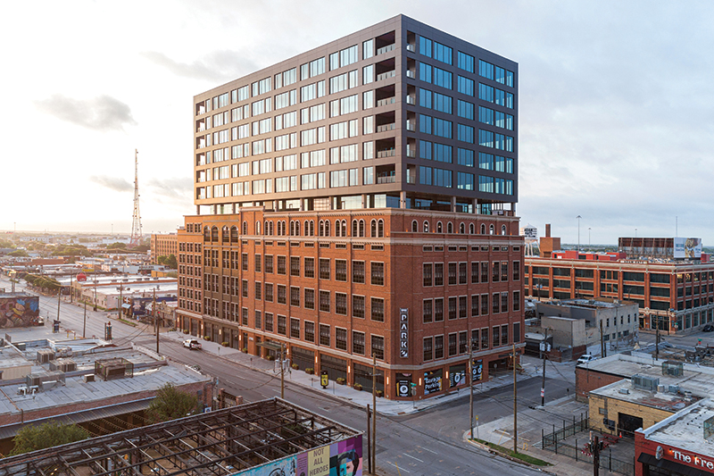
A historic post office in Houston gets a 21st-century makeover.
Project POST Houston
Client Lovett Commercial
Design Architect OMA
Executive Architect Powers Brown Architecture
Executive Architect – Food Hall LUCID
Contractor Harvey Builders
Lightning Dot Dash
Structural Engineer IMEG
Landscape Architect Hoerr Schaudt
Historically, humanistic thinkers on the built environment have cast Houston as the poster child for what not to do urbanistically. In her book “Thermal Delight in Architecture,” Lisa Heschong laments the city’s over-reliance on air conditioning, and William H. Whyte’s film “The Social Life of Small Urban Spaces” decries downtown Houston’s dedication to cars. In addition, Houston has long had a reputation as a city that insists on starting from scratch rather than embracing what already exists. Despite that reputation, the city slowly attempts to move itself toward a better future. POST Houston, a renovation by OMA and Powers Brown Architecture of an existing building at the edge of downtown, simultaneously embodies the progress the city has made and suffers due to the work that remains to be done.
The reoccupation of the building remains a work in progress. A music venue, food hall, and rooftop garden currently serve as energetic hubs of activity, but much of the building between these hubs remains vacant. The building provides spaces for retail and co-working, but those spaces have yet to find occupants. In a 2021 lecture with the Rice Design Alliance, OMA partner Jason Long states that the designers “really wanted to take seriously the idea of the building’s potential to be a civic space in its new life.” That potential is evident — the music venue, food hall, and rooftop frequently draw large crowds — but it’s unclear whether or not the developer will be able to keep the doors open at its current level of occupancy, regardless of the building’s popularity.
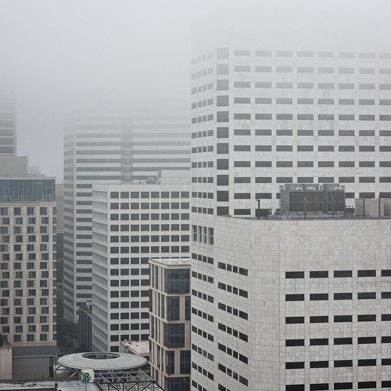
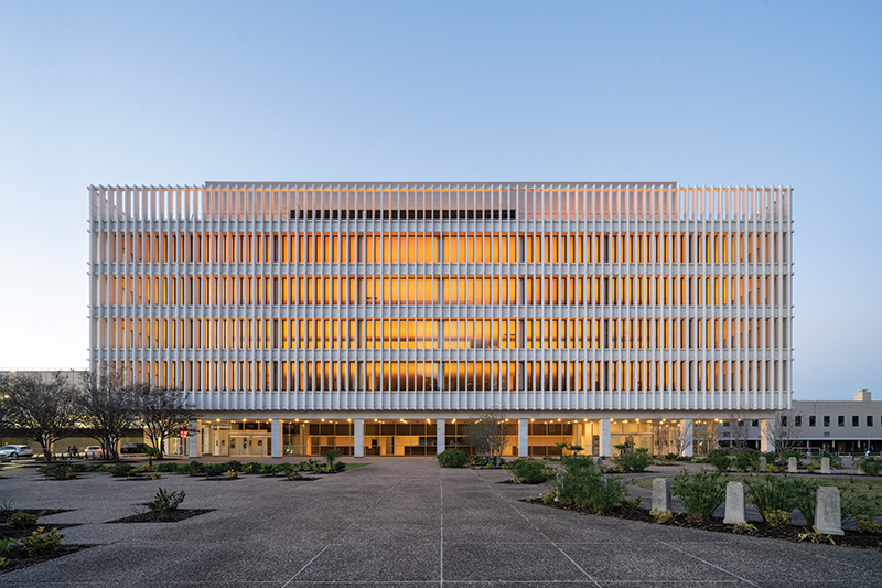
The formerly anonymous building, neutral in material and lacking the height needed to stake a claim on the skyline, now possesses a presence from the elevated highways that surround it, thanks to the verdant landscape and clear glass volumes that have sprouted up from its rooftop. Since closing in 2015, the former Barbara Jordan Post Office — named for the first black woman elected to the Texas State Senate, who was also the first black woman to represent any Southern district in Congress — has sat mostly vacant, nestled into the knuckle of Interstate 10 and Interstate 45 and flanked by Buffalo Bayou to the south and the rails of Houston’s Amtrak station to the north. The 1960s building designed by Wilson, Morris, Crain, & Anderson (who also designed the Astrodome) went on the market after the post office relocated its operations. Lovett Commercial, the sole investor, purchased the property months after the post office closed its doors, intending to reuse the existing building.
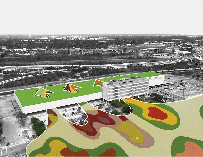
In the past, the property supported programs focused primarily on distribution. Prior to becoming a post office, the location served as a depot adjacent to Houston’s Grand Central Station. The task of converting the site to a program focused more on public gathering proves to be a challenging one. The surrounding roads, highways, and adjacent rail lines that made the site ideal for its previous purposes now serve as boundaries, separating the building from the rest of the city. OMA’s site plans and diagrams recognize this issue, but the work completed so far has not been able to address it — at least not yet.
The drawings suggest a more fluid connection to the rest of downtown, with bands of color washing over the parking lot, slipping beneath the south facade, and then rising up through the atriums to the roofscape above. In reality, the building feels removed from the fabric of downtown Houston: The parking lot remains intact, and historic preservation requirements prevented the architects from opening the south facade to the rest of the city as they had originally intended, leaving a solid band facing downtown.
Currently, the building feels less like a downtown landmark and more like a satellite — hovering nearby but not quite attached. When walking to the building from more pedestrian-friendly areas, such as Market Square, one must cross the bayou, Franklin Street, and the parking lot, with little shade provided along the way.
The roads and pavement present more of an issue than the bayou. Franklin Street’s five lanes of uninterrupted traffic make crossing the street a challenge. Once you’ve crossed that threshold, another barrier exists in the parking lot that wraps the building. Lovett’s website highlights “over 900 surface parking spaces” as a feature of the building, but that feature, with its lack of shade and sharp glare, further isolates the building from the rest of downtown — at least at the pedestrian level.
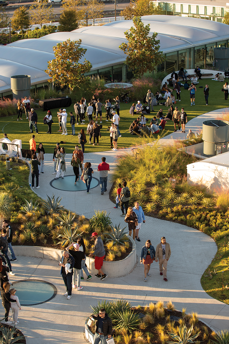
Although the connection to downtown at the ground level doesn’t quite live up to the promise of the diagrams, the rooftop landscape provides an ideal visual connection back to the skyline. Roughly level with the surrounding highways, the rooftop sits high enough to see over the busy streets that isolate it, yet is distant enough to take in views of high-rises to the south. That view works both ways, as the rooftop offers the most publicly visible aspect of the renovation, with drivers on the adjacent highways able to sneak a glance at the planted landscape on the roof.
The rooftop transitions gradually from controlled and rigid to free-form and fluid. The urban farm’s long, planted rows at the east end give way to winding paths and subtle hills toward the west that contrast with the repetitive rhythm of the existing building. While the rooftop experience is pleasant, it’s a shame that the historic status of the building limits the inclusion of trees large enough to provide shade that would keep the rooftop comfortable for a greater portion of the year. A more liberal interpretation of those guidelines would expand the usability of the building without compromising its historic character.
While the space between the building and the rest of the city is a work in progress, OMA and Powers Brown succeed at transforming the experience of the building itself. The interior provides the city with civic spaces that offer a respite from Houston’s hot, humid climate, which makes public gatherings a challenge during the summer months.
Internally, the 713 Music Hall provides an anchor space within the building. Clever details pay homage to a broad spectrum of the city’s cultural identities, incorporating actual elements in some cases and oblique references in others. Behind the merchandise tables, livestock fence insulators suspend steel mesh in front of heat-shield aluminized fabric, providing a framework for displaying band merchandise. These details juxtapose technology from the cattle industry with a material that feels like it belongs at NASA, revealing Houston’s multivalent influences. In the lobby, a grid of circular lights on a horizontal band mimics the Friday night lights of a high school football game, and patrons uninterested in the featured event can leave the suspended raked seating to seek refuge under the bleachers. While these references are subtle, the effects saturate the space, generating an atmosphere within the venue similar to the feeling during its debut as a gathering space in 2016, when it hosted the now-defunct Day for Night festival.
That festival, a three-day event celebrating light and sound that leaned toward the experimental and futuristic, served as a soft opening for the building’s new role as a gathering space. The abandoned post-industrial shell of the warehouse provided an ideal space for those looking to revel in a playfully dystopic atmosphere, at least for a few days. In a 2018 Cite Digital article covering the building’s role in the event, writer Jack Murphy describes how the festival’s bright lights projected onto the concrete facades felt reminiscent of the movie “Blade Runner.”
While the building in its current state does not provoke the visceral reaction of Ridley Scott’s masterpiece, it still expresses its own sense of identity and authenticity. The current experience of POST Houston is a bit less “Blade Runner” and a bit more “The Fifth Element.” Where the dystopic future in Blade Runner feels like an ominous warning of things to come, The Fifth Element makes that future feel like a roller coaster — a little jarring but mostly a lot of fun. The postindustrial edginess of Day for Night has given way to a space that’s family-friendly while still being vibrant, unique, and highly entertaining.
A primary contributor to this change in atmosphere lies in the expanded presence of natural light. Since Day for Night, substantial modifications to the building have allowed for the presence of larger internal spaces and connections to the roof plane. Four voids slice through the existing floor slabs. The largest of these incisions houses the music venue. The other three voids are capped with broad, billowing ETFE panels that allow sunlight to fill the spaces below, creating a series of atriums that open to the sky and the rooftop garden above.
The interior daylighting feels like a hole punched in the roof rather than an attempt to convince visitors that they’re outdoors. Ample light floods into the core of each atrium, but the spaces between remain shaded, creating a steady rhythm of light and shadow. As a result, the light feels like a presence you’re drawn toward rather than something that is omnipresent.
Throughout the building, modifications to the existing structure follow Rem Koolhaas’s stated preference for “history without preservation,” which he discussed at a 2012 lecture at Rice University. Cuts through the existing concrete structure feel surgical without being cosmetic. The slabs’ edges are lightly polished to create a more uniform plane, but those edges remain uncovered, exposing bits of white aggregate and rusty rebar within their thickness like a band of industrial terrazzo.
The surfaces of the remaining concrete structure remain largely untouched. The floor slabs unapologetically reveal a history that includes covered trenches into the surface and the residue of adhesives from finish floors that once concealed the concrete. These marks blend into a heterogeneous patchwork that meanders across the surface, oblivious to the building’s current occupation.
The columns within the space mark the building’s previous purpose more directly. Each column holds the remnants of multiple coats of paint, with bits of red visible beneath peeling layers of grayish blues and greens. Just above eye-height, an alphanumeric label marks each column’s location in the field of the grid. These remnants of the post office’s system for organizing the space provide a background texture that lends a sense of authenticity. The spaces retain some of the post-industrial character showcased at Day for Night, but turning on the lights is a bit like peeling back the curtain. The edginess begins to feel softer and normalized in the light of day.
The three atriums each contain a monumental staircase that defines the character of the surrounding space. OMA’s website describes these stairs as instruments for bringing people together. Each stair possesses a unique sculptural quality and offers a novel way of moving from the ground floor to the upper level and rooftop garden beyond.
The stairs operate in a manner similar to the structural spines at Houston Heights’ M-K-T, a nearby adaptive reuse project designed by Michael Hsu Office of Architecture. In both projects, these interventions into the existing buildings become moments of intensity cutting through the shells of the more typical spaces they inhabit, drawing attention while the existing structure fades into the background. These interventions become elevated as iconic moments that establish the identity of the project through both word of mouth and social media and provide much-needed appeal for those beyond the architecture community.
Within the western atrium, the “X” stair combines two vertical paths that cross at landings between each of the floors. Precast concrete treads rest upon a solid green stringer, while brass pickets create an elegant guardrail along the edge of the stairs and the second floor that surrounds it. The lightest of the three stairs, it seems to set the stage for a fashion show, ready for models to descend its steps like a runway. While the leasable spaces that surround this atrium remain vacant, the space in the immediate vicinity of the stair successfully plays host to temporary events where local artists and designers share and sell their work.
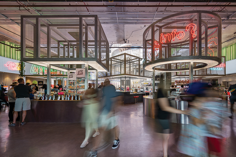
Vendor stations line the central atrium’s perimeter, and free-standing kiosks fill the floor within. (Houston’s favorite way to celebrate its ethnic diversity is through food, and the vendors offer a culturally diverse range of options that reflect Houston’s international population in what is by far the most active space within the building.) Steel frames wrapped in solid metal panels and open mesh — all painted silver — reflect the vendors’ colorful neon lights. The experience is a bit like arriving at a food court on a space station. At the center of the atrium, the “O” stair, with its two separate paths winding upward in a double helix, rises above the field of kiosks with vertical lights tracking the spiral of each stair as it ascends.
Of the three, the “Z” stair seems the most likely to live up to the promise of providing a space for interaction and gathering. Wrapped in stained oak panels, its oversized landings provide spaces where one can step off the circulation path and gather with friends or work quietly. But this stair, like much of the building, remains largely vacant: As with the “X” stair, the leasable spaces that surround this atrium stand unoccupied. A secondary public entrance to the music venue on the ground floor provides a source of activity, but only occasionally.
The building itself never seems to lack visitors, with the food hall, music venue, and rooftop garden all consistently active, if not crowded. However, a great deal of space within remains unoccupied, cordoned off from the occupiable spaces by long walls of glass storefront. Remnants of private events and maintenance equipment dot the otherwise empty floors. When you’re engaged with the activities, you tend not to notice these voids, but when you step away from the action, they’re difficult to ignore.
While many downtown buildings may suffer from this issue, as companies reduce their commercial real estate footprints after the COVID-19 lockdown, the empty floors of those high-rises remain hidden from view. This building is vast. If it were turned on its end, it would be among the tallest structures in the city. The ability to see so much unoccupied space on the first two floors feels daunting, especially when one considers the financial support the project has received: Federal historic rehabilitation tax credits earned by the project generated $23.7 million in equity. The ground floor seems primed to host retail spaces, and graphics on the upper-level windows suggest a co-working space is on the way, but it’s unclear when or if they’ll arrive. The question of whether the building will find the occupants needed to sustain it looms.
Internally, the building offers an intriguing example of how designers can augment an existing structure without consuming or concealing the original’s presence, a practice that Houston seems more willing to embrace now than it has in the past. But externally, it suffers from a focus on surface parking that is more reminiscent of Houston’s past than where it should be headed. Some hope remains that future development will mitigate these issues. Jason Long says that the “parking lots will potentially be developed and infilled over time to some extent, bringing more and diverse activities of the city into the whole property.” In addition to addressing the parking lots, discussions of a landscape that engages the bayou more directly are underway, but the timeline for these future developments is unclear. In its current state, the project remains on an island, removed from the rest of downtown.
Ultimately, the future of the project may be less in the hands of the designer or developer and more in the hands of the city itself. The potential exists for POST Houston to become embedded as a part of downtown, but to bridge the gap between the two, the city must continue to overcome its reliance on cars and emphasize and augment its walkability. What happens in the space between the building and the rest of downtown may determine whether POST emerges as an active civic space within Houston’s urban landscape or fades into a vacant curiosity, best viewed from the surrounding highways.
Ross Wienert teaches at the University of Houston College of Architecture and Design and practices at CONTENT Architecture in Houston.

Ross Wienert teaches at the University of Houston College of Architecture and Design and practices at CONTENT Architecture in Houston.