Nov 01, 2021
Last year when we chose the topic of “mental health” for this issue, we thought this whole global pandemic thing…


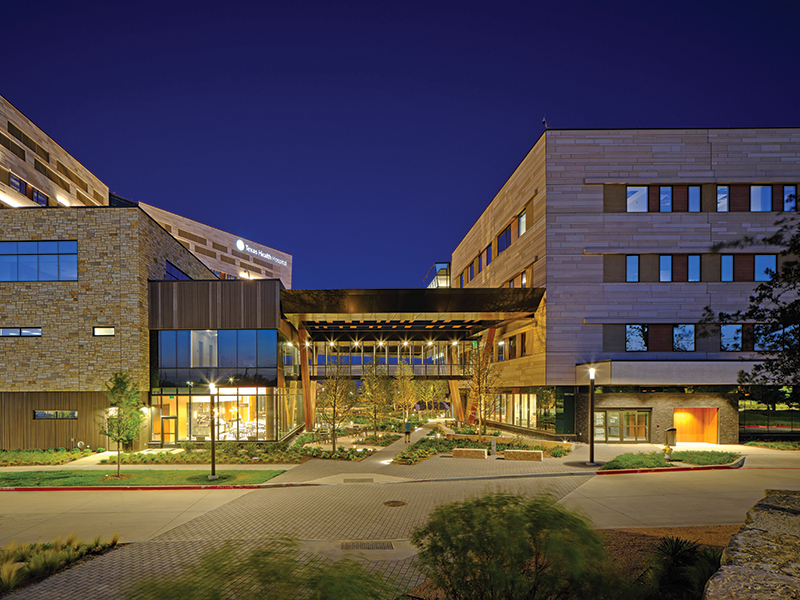
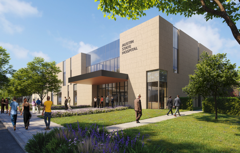
Bold architectural moves combine with an even bolder landscape strategy in the Texas Health Frisco project.
Client Texas Health Resources
Architect HKS
Contractor Austin Commercial
MEP Engineer WSP
Structural Engineer Thornton Tomasetti
Civil Engineer RLG
Landscape Architect TBG
Kitchen Consultant SDI
The mass of Texas Health Frisco looms large for anyone driving the farthest northern reaches of the Dallas North Tollway. As one moves through the perfectly flat plains of recent suburban development, this dynamic edifice immediately stands out from the proliferation of beige homes, strip malls, and garden apartments. The building is inspired by nature and geology, but not that of its immediate context. The result is that both the building and its site possess an articulation and materiality rarely found in health care projects.
Led by the client’s desire to differentiate itself from its competitors and a conceptualization of the building as a “health facilitator,” HKS sought to move away from the “plan it and skin it” approach that sometimes drives medical facility design. They began the effort with a deliberate decision to design with an integrated project team, considering all aspects of the facility from start to finish.
The architects at HKS brought all stakeholders and consultants together from the beginning, which helped integrate all aspects of the design. This is especially true of the landscape design by TBG Partners: Although context and connections near the site were limited, an effort was made to physically tie the project to the existing neighborhood to the northeast through the creation of a landscaped corridor imagined as a “seasonal dry creek.” This axis runs diagonally across the site, culminating in the main entrance and vehicular drop-off.
Due to the project’s location adjacent to a high-speed toll road, much of the landscape design involves large moves that are legible while viewed at highway speeds. A large portion of the site is planted with drought-tolerant native prairie grasses, which require no ongoing irrigation. As one moves closer to the main entrance and shaded canopy breezeway, the planting strategy and landscape becomes much more detailed and varied, engaging the visitor at the pedestrian scale. The canopy breezeway between the hospital and medical office building creates a pleasant outdoor space, surrounded by dense vegetation similar to a forest floor. This shaded and protected space is a welcome amenity for a medical facility.
As the design team at HKS sought to provide a conceptual framework for the building itself, they reached 250 miles to the south for inspiration — to Hamilton Pool, just west of Austin. The layers of stone and the outcroppings over that natural body of water became key principles in the formation of the main features of the building, with the main volumes imagined as natural geologic rock formations, building entrances envisioned as eroded areas of the building mass, and the towers’ cladding echoing geologic striations.
The hospital’s massing is broken down into programmatically distinct volumes. All are clad in various expressions of a 9-inch thermo-mass insulated precast system that provides a resilient, durable outer shell for the critical functions on the interior. The most prominent expression of the precast panels is the horizontally striated limestone-like panels which clad the towers. Starting with the client’s request to avoid the grid-like panel joints typical of precast structures, HKS undertook a sophisticated study of the precise shape, jointing, and finish treatments of the tower panels. This resulted in the staggered edges, allowing the creation of a more monolithic appearance while camouflaging the joint lines. The lower volume, housing the public areas on the ground level and surgery on the second level, is clad in a brown, vertically striated precast. Overhangs at the vehicular and pedestrian entrances provide protection from the sun and are clad in the limestone-colored precast, an allusion to rock outcroppings. Immense mass timber columns are prominently featured where the building hits the ground, at the point of human interface. Arranged in “V” configurations, they support the multiple shade overhangs and canopies. These columns are part of the design team’s effort to incorporate biophilic design into the project, either by using natural materials or by adding natural touches to manufactured elements.
While the project’s various design elements are all individually handsome, as one walks toward the main entrance and courtyard area, the V columns provide but the first hint that parallel lines were frowned upon in the planning of this building. The geometries of the building forms and canopies include an abundance of odd and seemingly random angles. Windows, precast facades, and other elements in both plan and elevation, all angling in one direction or another, culminate in a seemingly haphazard assemblage. The landscape design adopts a similar geometry, adding to the collection of lines and bands of material crisscrossing the site. One has to wonder if a simpler geometry might have furthered the original goal and provided a more serene and calming environment.
This zealously patterned and angular treatment continues on the building’s interior, which was conceptualized as the crystalline interior of a geologic cavern. The main lobby contains a generous skylight where sculptural light-fixture “crystals” are hung. Similar crystal-like patterns are used throughout the lobby in screens, textiles, flooring, and even in the shape of the seating itself. The geologic concept finds its most literal expression in a geode display wall that leads from the main entrance lobby to the cafe.
Moving up into the tower to the patient floors, the geologic concept is mostly (and wisely) left behind in favor of a simpler expression focusing on warm materials, natural tones, and functionality. At the far ends of the tower, generous light-filled visitor lounge and nourishment zones are provided.
By engaging all parties from the outset, the design team was able to create a dynamic and surprising health care facility. The biggest successes are those moments — exemplified in the covered and vegetated breezeway, the generous landscaping, the large, daylit waiting areas, and the dynamic cladding system — that provide a generous experience for patients, visitors, and staff. A hospital is an exceedingly complex facility to design, and it is clear that many aspects of this building were studied and analyzed in great detail. Care was paid to each individual aspect, but the overall arrangement of the whole could perhaps have been resolved in a simpler expression with greater success. Even so, the project as it exists is a welcoming facility, one that certainly sets itself apart from its competitors.
Andrew Barnes, AIA, is a principal at Agent Architecture in Dallas.