Dot Matrix
Steven Holl once said, “Light is to architecture what sound is to music.” The decisions architects make about the way light comes into a space are probably the most impactful commitments in the design process, and those decisions demand thoughtful consideration. Transparency is often defined as the condition that allows light to pass through a material so that objects behind can be seen. The word “allows” suggests a degree of control: How much light passes through determines whether we consider the material transparent, translucent, or opaque.
Though glass has been around as early as 3,500 B.C., it wasn’t until Roman times that it was used in buildings. Insulated glazing was invented in 1865, and the technology slowly started to make its way into commercial development in the 1930s, becoming commonly available in the ’50s. Glass has a major impact on the experiential quality of a space and is often a primary component of the overall design concept. Glass technology has shaped and repeatedly redefined architecture, and its most recent evolution offers a broad spectrum of new possibilities.
Today’s exterior glass is most commonly a 1-inch clear insulated vision unit, with or without low-e or other coatings (such as scratch resistance or self-cleaning), with an assortment of tints offering variable performance. Typically, a glass surface is expected to be homogeneous, with no variation. In the ’70s and ’80s, the prevalent stylistic trend was toward highly reflective, deeply tinted glass facades. Since then, cities (and, frankly, architects) have been trying to find alternatives to these impersonal, unwelcoming buildings that lacked transparency. I confess that the desire for highly transparent and colorless glass has dominated my career, perhaps partly as a reaction to this previous era. However, the desire for the clearest glass comes with its own set of difficulties. There are many forces pulling the selection of glass for a project in different directions — energy codes, glare, comfort, reflectivity, and of course the client’s preferences. Glass selection is an act of compromise.

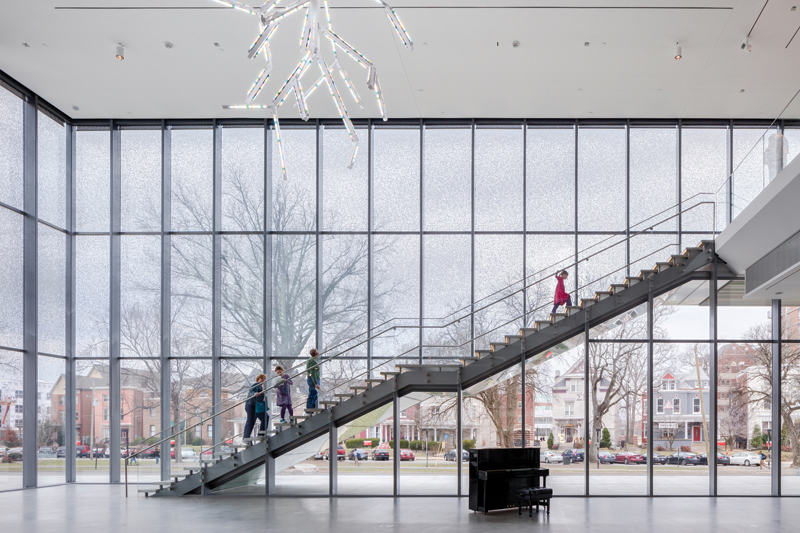
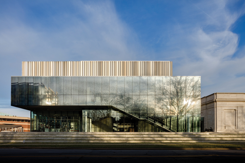
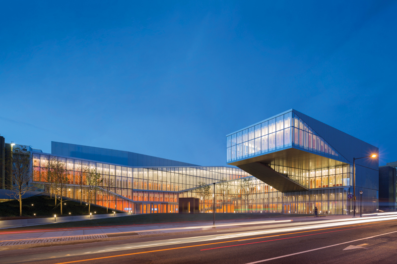
The campus of the Krishna P. Singh Center for Nanotechnology at the University of Pennsylvania uses a vertical stripe pattern that has an understated presence on the exterior and creates a prominent layering of shadows in the interior space. Photo by Albert Vecerka/Esto.
Technology these days offers what seem to be limitless possibilities. In addition to low-iron, clear, and tinted glass, there are low-e coatings that can be applied to surface #2, surface #3, or both. Other technologies, such as electrochromic glass, holographic optical elements, and aerogel glazing offer even greater flexibility. These technologies, however, are in a different budgetary category, so for purposes of this commentary I’m going to lay them aside.
Frit technology is a practical application that has been lingering in the background for a long time. It has traditionally been used for spandrel glass in non-vision sections of storefront and curtain wall. Over the past few years, it seems that frit is no longer relegated to performing as a backdrop, however, but is instead becoming a key element of the design concept. The implications of how we use frits are quite impactful and can not only articulate the design but also appreciably improve performance in multiple ways. You’ve probably heard about bird-friendly design. Controlling the level of transparency on a glass wall is a way to make buildings that birds won’t fly into. Furthermore, where energy consumption is a big consideration, frits can assist in controlling solar heat gain.
There are many ways to block solar radiation. Exterior shading systems are best known and can be quite efficient because they prevent heat from infiltrating the envelope; however, the use of frit patterns can be a cost-effective alternative: The pattern can function as a veil, and the performance improvements will vary according to the pattern configuration and density. Are you looking to blur away the joints between the glass panels or create controlled views out of a building? Perhaps you want to protect the contents of a space from direct sunlight without using window treatments. A printed pattern can break up reflection, reduce the “hardness” of the glass, and make a surface highly articulated without the use of a double skin.

The campus of the Krishna P. Singh Center for Nanotechnology at the University of Pennsylvania uses a vertical stripe pattern that has an understated presence on the exterior and creates a prominent layering of shadows in the interior space. Photo by Albert Vecerka/Esto.
Frit can either be silk-screened or digitally printed. In the silk-screen process, ceramic frit paint is applied to one side of the glass and then heated in a tempering furnace to create a permanent coating. In digital ceramic printing, ceramic ink is applied directly onto the glass — in much the same way that an inkjet printer prints onto paper — before the ceramic frit designs are fused onto the surface during the tempering process. Silk-screening has certain limitations: It is most efficient when the same pattern is used repetitively and the glazing doesn’t exceed the manufacturer’s width and length limitations. Though there are initial setup costs, digital printing allows greater flexibility. (Setup costs have come down substantially as the technology has become more mainstream.) Digital printing doesn’t benefit from repetition, so the sky is the limit when it comes to pattern and colors.
When thinking about using frit, it is critical to remember that adding a white or light color to the surface of the glass will increase reflectivity. Whether it is a pattern or a solid or frosted band, reflectivity can quickly escalate several percentage points. After recent concerns in the Dallas Arts District about reflectivity and unintended consequences, many jurisdictions have become concerned and added or adjusted existing zoning regulations to limit its percentage. Some have reduced the maximum allowable reflectivity to as low as 20 percent, which can be very hard to achieve and will limit options when designers seek high-performance glass that is not tinted or dark. Using a tinted substrate or a reflective coating can notably diffuse or diminish the graphic effect and legibility of a pattern. When deciding to which surface the frit should be applied, it is important to think about how the low-e coating will affect color, because results can vary dramatically as the result of this choice. Should the pattern go on surface #2, or #3, or both? Low-iron glass can be the best choice if the color of the frit is intended to render as closely as possible, or when a green hue influencing the pattern is not the desired outcome. Utilizing multiple layers of patterns can have compelling results, and laminating glass is an option to help preserve crispness and resolution. Allocating enough time in the schedule for multiple rounds of mock-ups is paramount.

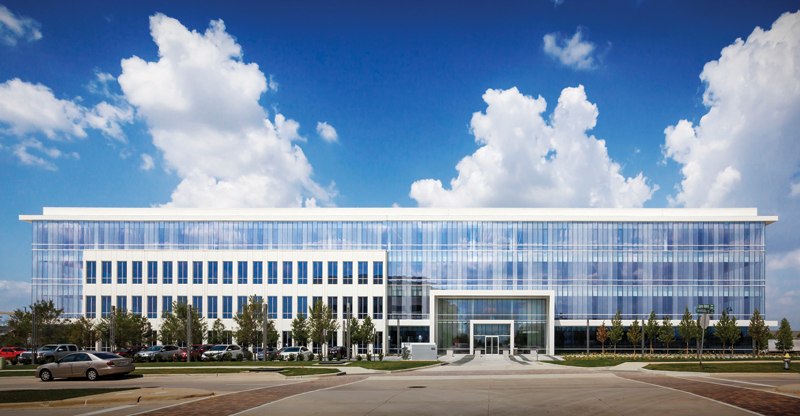
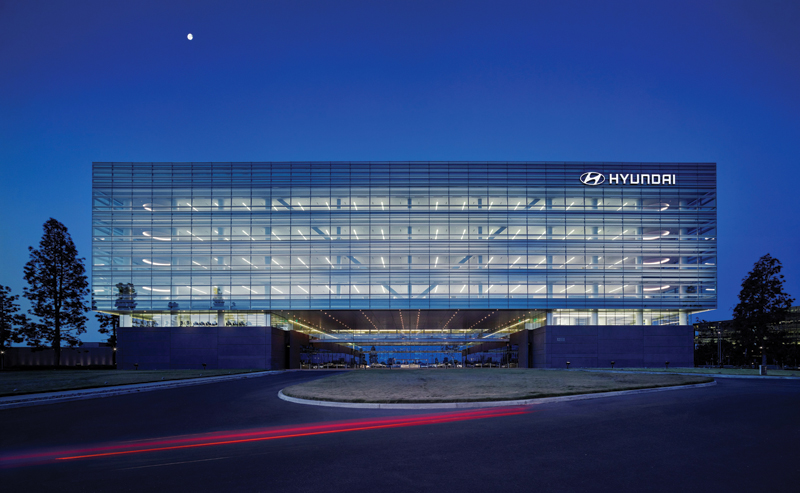
“Missoni” dot pattern at the 9111 Cypress Waters speculative office building in Dallas. The percentage of “openness” differs across four different panels in a delicate variation that also functions as a protective veil. Photo by Andrew Adkison, AIA.
We recently used a frit configuration in what our client christened the “Missoni” pattern on a speculative office development in Dallas. We used dot patterns with multiple percentages of openness to achieve the shimmering effect we were looking for. The southward-facing glass box is designed to ameliorate the harsh light and heat of the Texas sun while maximizing views of the park across the street.
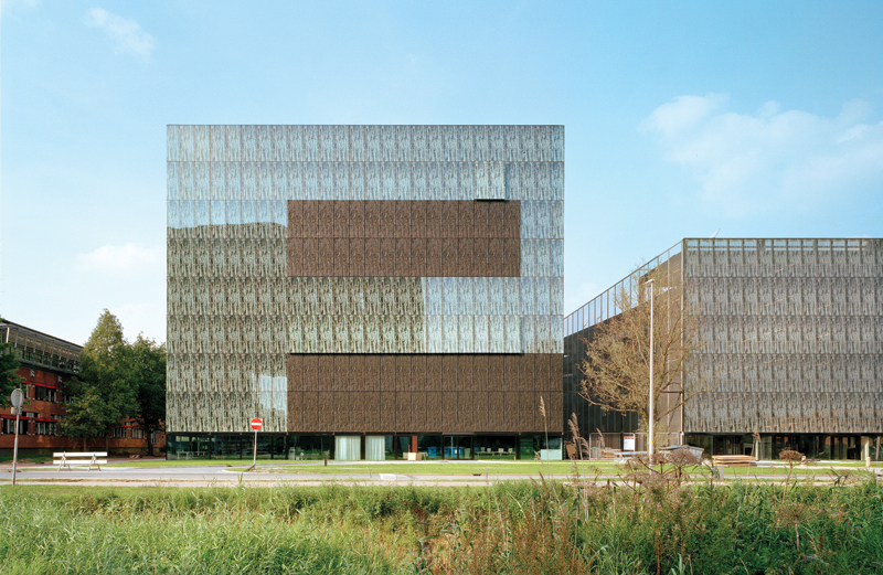
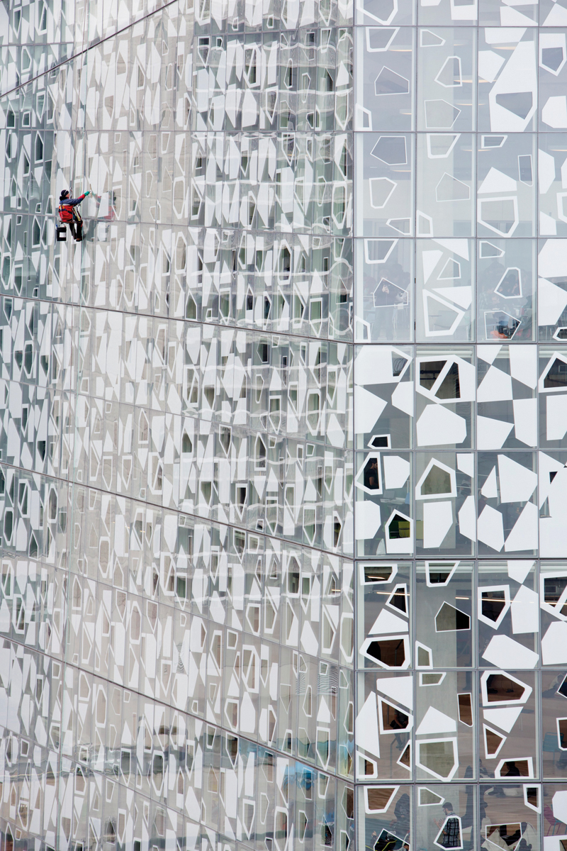
Frit can change the experiential qualities of a glass surface, or the structure itself. Here are a handful of examples that use unique textures and patterns to provide a particular level of transparency. Each example has a different context and scale, and a distinctive look, with patterns ranging from simple shapes and gradients to intricate designs. When we use digital printing, we have the ability to calibrate transparency at both the macro and micro levels. Adjusting gradations and transmission of light from opacity to transparency — and manipulating changes in dimensions of geometric shapes forming the pattern — can be highly intriguing. That level of control has the potential to promote and embrace ambiguity. It is the kind of complexity that allows for multiple interpretations of light within a space.
Light has been culturally associated with notions of integrity, morality, and epiphany. Modulating the levels of transparency allows us to regulate the viewer’s experience of light in relationship to space, stimulating an emotional response. Transparency suggests freedom from pretense, and one could say clarity might indicate purity and enlightenment. Translucence may convey a feeling of uncertainty and mystery. So, the next time you are developing a design concept, be thoughtful about how transparency and light will be experienced.
Maria Gomez, AIA, is a principal at GFF Architects in Dallas.
