Jan 07, 2020
Behold, thou hast driven me out this day from the face of the earth; and from thy face shall I…

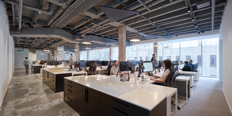
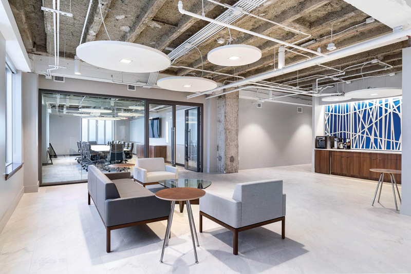
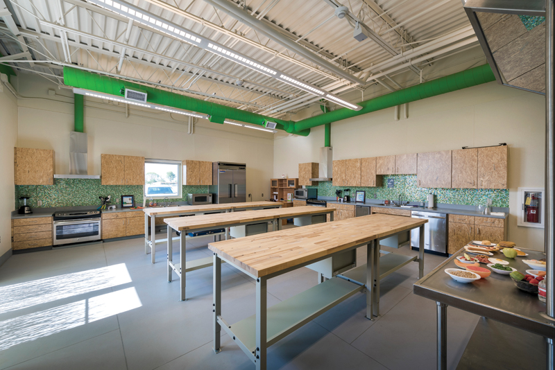
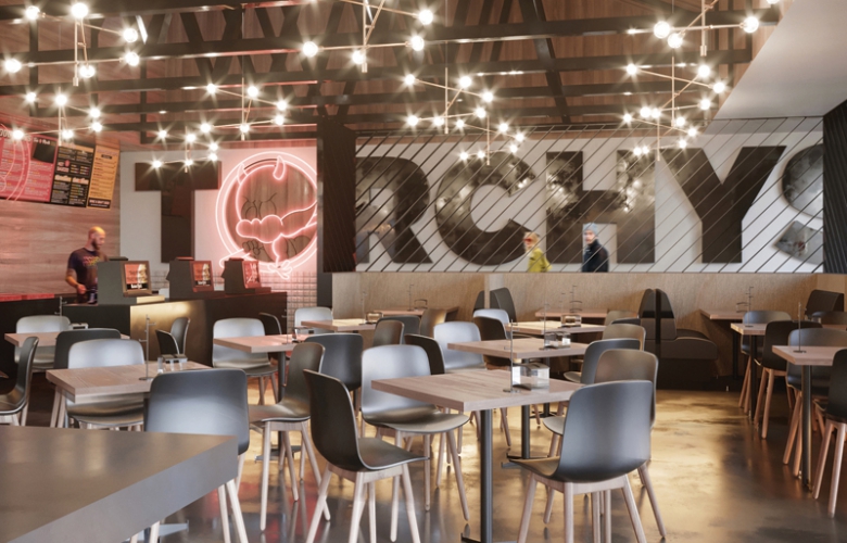
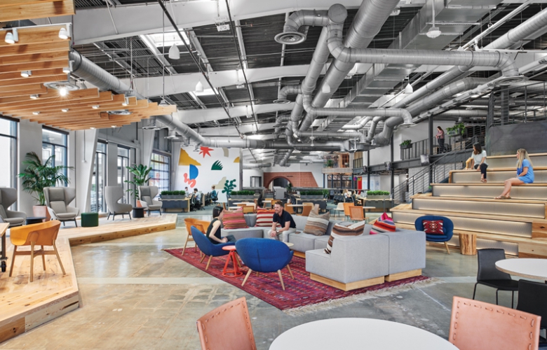
Eat in a restaurant, drink coffee in a cafe, shop for jeans in a boutique, change your oil at Jiffy Lube, and the spaces all share the same design aesthetic: exposed concrete floors, exposed structure, exposed building systems set off by horizontal wood slats cladding everything else. The hipness, if that’s what it is, can be suffocating, sort of a grunge version of the blandest white drywall, lay-in ceilings, and wall-to-wall carpet. Does the zeitgeist require this? Do all interior projects need to look the same? Is it the work of lazy designers? Architects ignoring the making of space for simply in-filling it with functions? Is this the natural progression of the move to inhabit industrial lofts in the 1970s?
Doing an interior within an existing space used to be an opportunity for designing something without the constraints of waterproofing: no leaking roofs. You could make something special happen in those spaces that allowed for the exploration of ideas and materials without pesky flashing details. Alas, something has changed. Architects are content (complacent?) to just accept the spaces they are given. Ignoring any obligation to shape or form these volumes seems to be a repetitive pattern in current design thinking. Considering spaces like these, often the architect’s work seems to be a small number of highly resolved and articulated interventions: the overwrought barista bar; the expressive light fixtures; an elaborate Mondrianesque window wall that slides or pivots, its dirty, unground welds distracting from the view. These are placed like jewelry among so much spatial and material dross, reminding anyone who looks at them that the space was not so much taken over as strategically intervened with, and here (please pay attention) are the good bits. See? We are clever and talented and understand how to detail and build things! We just couldn’t be bothered with considering the entire space.
High modernism strived for a highly crafted and finished look, taking cues from the machine aesthetic but not the machines themselves. Inspiration was found in automobiles, ocean liners, airplanes, all objects that expressed their functions but covered up all the messy parts. The engine was under the hood, the turbines concealed in the decks below; the juicer didn’t show you the electrical motor and wires. Everything exposed was studied and shaped for the impression of airflow, containment, and speed. Modernity equaled streamlining.
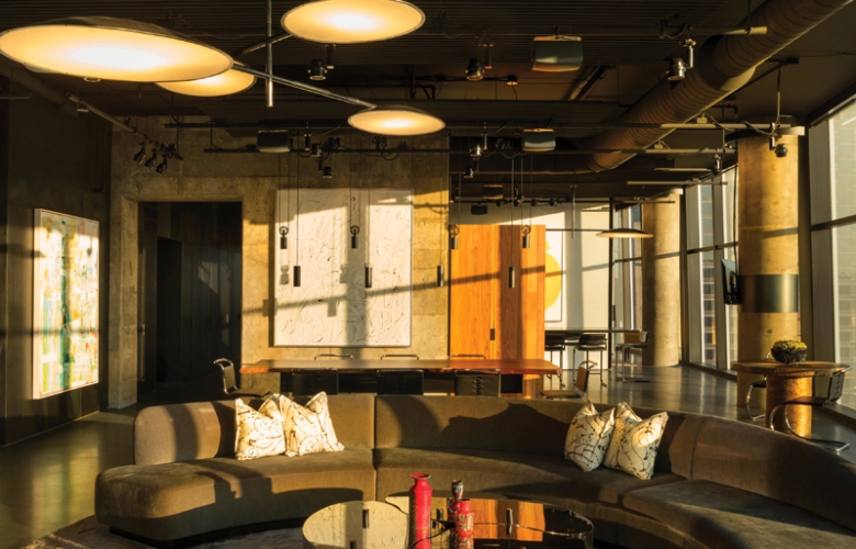
High-tech, the precursor of this current idiom (let’s not be coy; “aesthetic” is too thoughtful a word for this complacent bastardization), took a mannerist view toward systems, à la Centre Pompidou. That architecture was all about the bones too, but the bones were expressed and fussed over in a loving way, their forms explored and shaped with an eye toward their contribution to the expression of not only their function but also the space within. Architects studiously organized structure and systems, frequently altering their scale and form to create an impression of the systems’ functions, though often they were really not that functional at all.
All of this would be fine if it didn’t beg the question, what happened to space? You may remember that’s what we architects do at our most fundamental level. Making space is what sets us apart from engineers and contractors. It’s our raison d’être. Remember those beautiful volumes we were all shown in History of Architecture class? Iconic modern projects that expanded when filled with light, found life, and reflected it back on us? These spaces evoked clarity and goodness, all pristine and crystalline, aspirational and lucid. Have we moved on from the spatial examples of Le Corbusier? Of Aalto? Of Wright? Of Mies?
If I make a list of the great monuments of high modernism created by the likes of those listed above, none expresses its guts or bones in a way that is casual or without great study and care. Mies made an entire architecture out of them bones. What gorgeous bones they were, too! All that precision-crafted steel, finished to the smoothness of a baby’s butt, every weld ground to perfection, every inch of it lustrously painted. The early villas of Le Corbusier were light-filled containers, the spaces informed and animated by light — an obsession, really, and constantly remarked on in his writings. His later, more brutalist buildings were rougher and raw in the expression of their forms, but all of it was shaped in support of the spaces and how they filled with, and came to life in, the light. Picture the well of the Guggenheim. Would it be better if insulated ducts were exposed under the ramps?
Is the idea of luminous space, container of light, expander of the soul passé? Would the Pantheon be better with black bar joists and the oculus a raggedly cut circular opening in metal deck? I am spending a lot of time considering this look (because it is ubiquitous and I can’t get away from it) and wondering, is it a response to rising construction costs, or is it a deliberate visual choice (can we use the word “style”?) of the present time? It’s not that I’m opposed to it. There’s something fresh and original at first when formerly open commercial space is inhabited in this manner and minimalist interventions allow the volumes to achieve a kind of grandeur. But now that it has become the default way to design and execute every project type — stores, restaurants, hair salons, mechanic shops — one wonders, is every bar joist shopping strip a turn-of-the-century manufacturing building waiting to be exploited? The answer is no.
In the late 1960s and early 1970s, pop culture influences began to find their way into architectural design and discourse. This married the then-nascent critique of modern architecture and the now popular view that it was elitist, unresponsive to human needs, and overly formal. Many practitioners were exploring ways to adapt the program of modernism (open spaces, abundant natural light, breaking down of spatial hierarchy) and “soften” and adapt it for a broader audience. This paralleled the move toward high-tech design, the so-called celebration (some would say fetishization) of structure, building systems, and the view of a building as somehow being an organism — some Japanese even called it Metabolism. Projects completed at this time had a very specific look and feel, and indeed the “bones” (and sinews and ligaments and organs) were all on display, the purview of architects and designers. Many of the projects completed in this era were astonishing in their freshness and originality, and many endure now as stunning examples of the movement and its stylistic influence.
The Ur building of this time period was probably Centre Pompidou, the Parisian art museum and cultural center completed in 1977. The diagram of the 1971 international-competition-winning-design — created by a very young Richard Rogers (age 38) and an even younger Renzo Piano (34) — suggested an endlessly flexible frame into which functions could be inserted and arranged to suit changes in program and patterns of use. It reimagined the idea of a museum from that of a repository for the contemplation of culture and ushered in the museum as a participatory experience (can I rent you a set of headphones so you don’t have to be bothered to read the labels on the paintings?). The building and its iconic presence far outweighed the offerings inside. In pursuit of this conceptual idea, Piano and Rogers designed a structure of widespan steel trusses that created open, loft-like floors that could be subdivided and arranged as best suited their uses. Exposed building systems gleefully (some would say willfully) expressed as separate from the frame, ductwork and electrical buses were color-coded, highlighted in their layouts, and carefully organized to provide the “decoration” of the building. It was all visually dazzling and fun to visit, not least because of the famous glass-enclosed exterior escalators that snaked up the exterior to a roof terrace for wonderful views over Paris.
In actuality, the promised flexibility was a chimera. The building proved to be extravagantly expensive to operate and maintain, and subsequent renovations and updates have proven significantly more expensive than the construction of the original building. As an idea, it’s still compelling, and it certainly has a presence.
Closer to home, firms were adapting these ideas, but in the vastly more commercial world of American architecture and construction, they were pursued thematically but not with the wit, rigor, or discipline of Centre Pompidou. Think Houston’s George R. Brown Convention Center. Architects were willing to settle for the systems being exposed, but were not willing to design them in the architectural sense (and certainly not willing to incur the costs). Some firms did it well, Hardy Holzman Pfeiffer Associates being the exemplar in this regard. Their 1974 Columbus Occupational Health Center in Columbus, Indiana, is an exceptional example. Of the project, New York Times critic Paul Goldberger opined, “The firm’s work is rather brash, often irreverent, more a collage of interesting elements than a pure statement.” But it was eminently humane, accessible, and fun. The exposed elements made you look, expressed and enhanced the spatial qualities of the buildings, and were often just delightful to consider and comprehend.
These sentiments cannot as easily be ascribed to contemporary “bare bones” projects. One wonders if the architects creating these spaces know the origins of exposing the structure and systems, or if their work is just a second-hand, unconsidered application of an erstwhile aesthetic.
Michael Malone, FAIA, is a principal at Malone Maxwell Borson Architects in Dallas.

Michael Malone, FAIA, is the founding principal of Michael Malone Architects and an adjunct assistant professor at the School of Architecture at the University of Texas at Arlington.