Nov 20, 2017
There is a small crack in the flashing around one of the pipe vents that protrudes from my house’s metal…


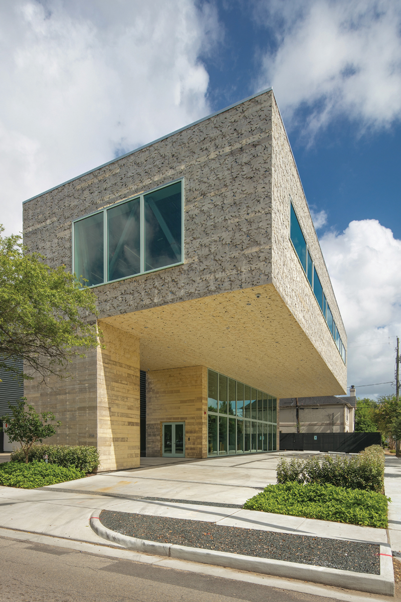
“Big room. Parking. Display element,” says Dillon Kyle, AIA, ticking the items off on his fingers. “That’s the building.”
The principal of Houston-based Dillon Kyle Architects is sitting in one of his new office’s two conference rooms. It’s on the second floor of the three-story building his firm designed for itself on the corner of West Alabama and Mulberry streets, just across from The Menil Collection. An antique Oriental rug covers the unfinished oak floorboards. The steel-truss ceiling is exposed, allowing a good look at the conduit and wiring, which were un-detailed by the architects, left to the whims of the contractors. This was intentional. Kyle wanted the interior to be raw — “not overly fancy,” in his words.
The walls are a pale green color — like a 1960s hospital, in a good way (actually soothing!) — except for one, which is glass and affords a view of the underside of the studio. That space — the “big room” — is about twice as wide as the two spaces below it. It sits up in the tree canopy and cantilevers 24 ft out above the site’s nine parking spaces and the somewhat-lively-for-Houston street corner. (Kyle has another lot nearby for his 22 employees.) Gray steel shelves supported on bright yellow pegs separate the room from the glass wall, and on these shelves is the architects’ materials library.
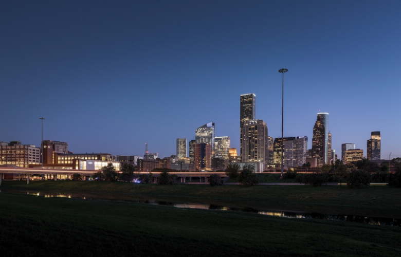
“It’s a walkable part of Houston,” Kyle continues. “Once the Menil completes its master plan, Mulberry will become a more prominent axis for the campus and the new Menil Drawing Institute. So this building becomes a signpost, pointing to increased public activity.”
Appreciating their prominent location, the architects were keen on the new building having a civic presence. The cantilever gives passersby a place to cut through on foot. It also links up with the neighboring Sicardi Gallery, and Kyle lets that institution use his parking spots after six in the evening. As the general public makes its way past and under this curiously looming, upside-down-L-shaped building, they get a glimpse of the materials library through the glass wall. The gesture is meant to communicate the job of the architect to people who notice the building, and people have been noticing.
“It’s become like the Biscuit paint wall in Montrose,” says Heather Kyle, AIA, DKA’s project director (no relation to Kyle himself). “People take their Instagram shots in front of it.”
Post-selfie, if one looks closer at the building, they’ll see perhaps its most delightful element: the Accoya wood cladding, which is currently on its way to oxidizing to an appealing silver-gray color. The material, unfinished in this application, is treated in a vinegar bath that makes it impenetrable to moisture and keeps it from warping in the weather. There are 144 panels, which have been CNC milled to form a shifting pattern of overlapping bur oak leaves. The effect is both abstract and referential, a great finish for a building that is both unabashedly modern (rectilinear) and curiously natural (randomized).
Aaron Seward is editor of Texas Architect.

Aaron Seward is managing editor at Perkins&Will and a former editor of this magazine. He lives in Austin.