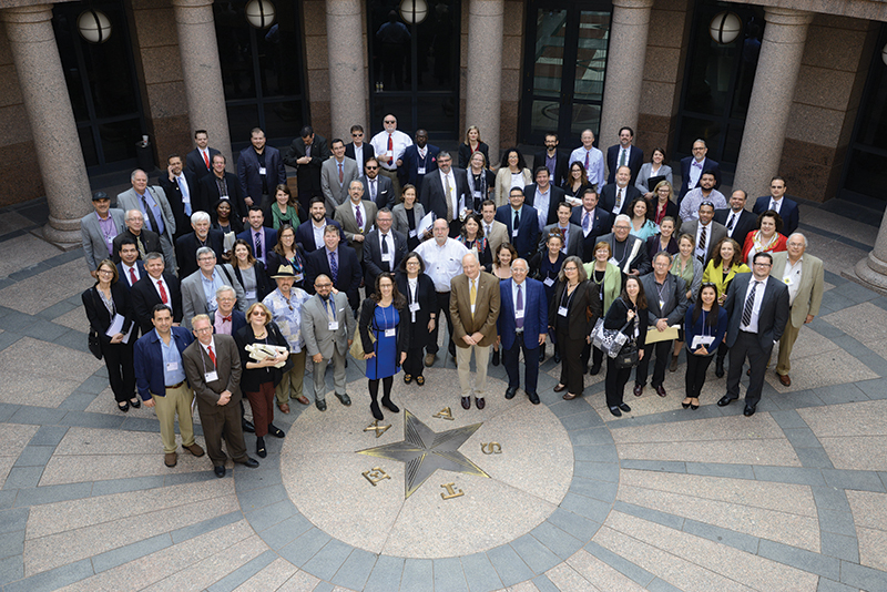
Jan 12, 2023
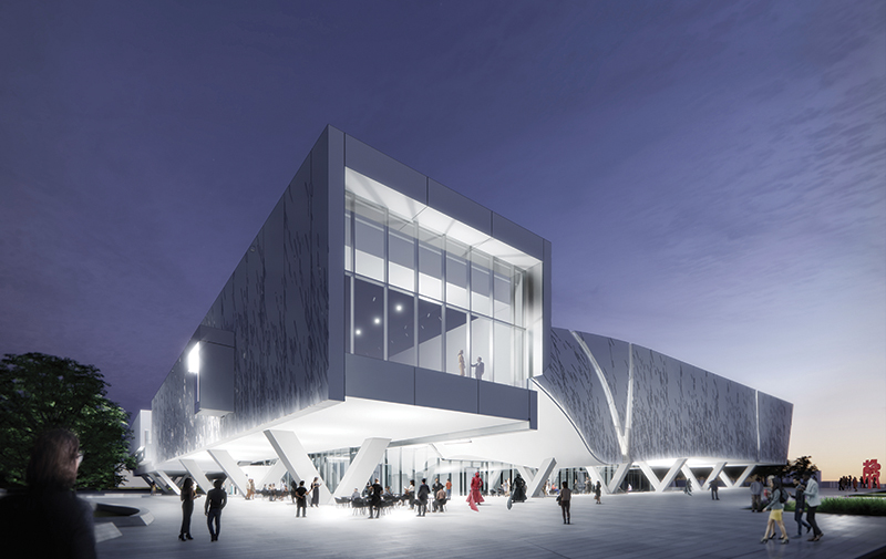
This past May, the University of Texas at Dallas announced the groundbreaking for the new Crow Museum of Asian Art…
The Montrose Collective celebrates the eclectic and inclusive spirit of its Houston neighborhood.
Location Houston
Client Radom Capital
Architect Michael Hsu Office of Architecture
Contractor Harvey Builders
Structural Engineer HOK
MEP Engineer DBR
Civil Engineer Kimley-Horn
LEED Consultant Paladino
Parking Consultant HWA Parking
Landscape Architect Office of James Burnett
Graphics LookThinkMake
Along Westheimer Road, between the Montrose and Midtown neighborhoods, sidewalks directly abut the street’s narrow lanes of traffic. A six-inch curb offers the only separation between pedestrians and oncoming vehicles. Curb cuts pierce what little protection those curbs offer, generating a relationship between pedestrians and vehicles that feels treacherous.
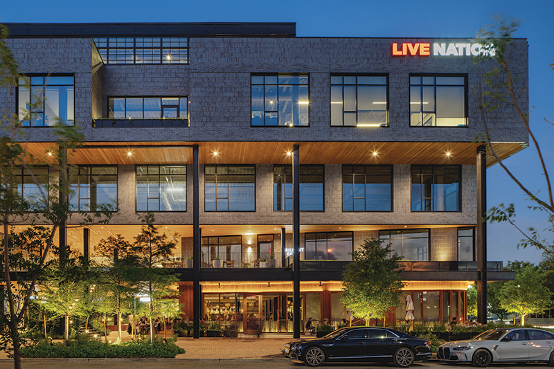
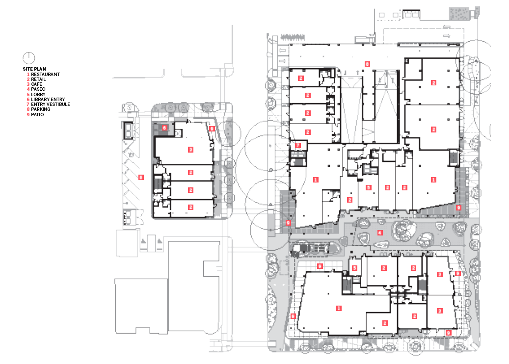
Montrose Collective, designed by Michael Hsu Office of Architecture, is comprised of two structures — Building A (184,232 gsf) and Building B (19,542 gsf). Building A replaces a two-story strip mall and double-loaded parking lot separating the building from the street and sidewalk — a relatively common typology among the previous generation of commercial buildings that line Westheimer. In this project, the architects flip that relationship, opting for a combination of business in the front and parking in the back.
The new orientation enables the building and landscape to conspire in creating an environment that feels safe and comfortable to explore on foot. Rather than asking pedestrians to rely on a six-inch curb and a lot of faith, the landscape provides them with comfort and protection. The sidewalks ramp up gradually so that much of the path feels like a refuge elevated above the oncoming traffic, and a wide band of trees and planting beds offer a barrier that feels significant.
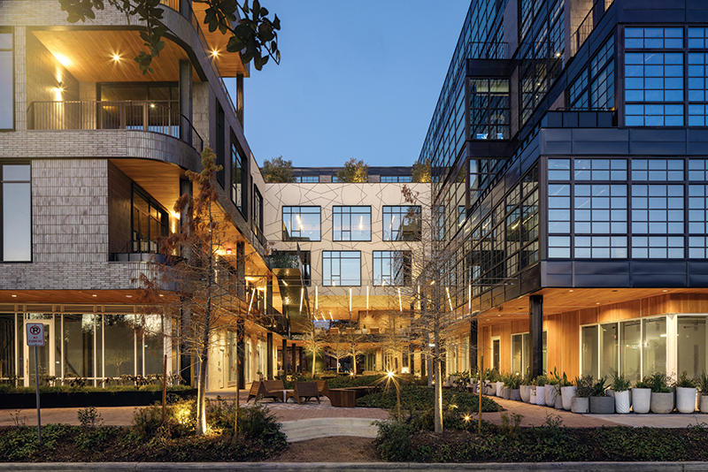
Hospitality and retail spaces are located on the bottom floors and commercial offices fill the spaces above. These programs come together in a building that offers a nudge in the direction of increased density without disregarding the scale of the residential neighborhood it borders. The Montrose neighborhood, from which the building derives its name, has historically served as the center of Houston’s LGBTQ+ community and currently is home to an eclectic combination of unique shops, restaurants, and night spots. The design of Montrose Collective echoes this atmosphere, with an inclusive attitude toward materials and details.
Elements of the design feel playfully rebellious. In some cases, brick walls turn a corner with a soft radius; in others, the brick turns the corner at a right angle, but instead of one sharp edge, it offers three. Materials transition from brick, to wood, to rounded shingles, with colorful storefronts mismatched in a way that manages to feel earnest.
This combination of features would make a rationalist cringe, yet the building successfully manages to pull off this complexity with style.The coordination of those diverse moves might have been finicky and carefully curated — or whimsical and carefree; it’s hard to tell. However, the assertion by Michael Hsu, FAIA, that “we want everything to be done right and done well, but we also don’t treat everything as so precious” suggests the latter. The design embraces difference and demonstrates its unique personality, coming across as quietly cool, confident, and unapologetic.
That confidence and sense of cool likely results from the spatial depth that it offers. While it’s common for commercial buildings to gesture toward depth with shallow balconies and subtle recesses, it’s rare that they provide the degree of spatial relief that becomes inhabitable. At Montrose Collective, that commitment to depth is fully realized. It’s a credit to the developer, Radom Capital, that they were willing to sacrifice leasable square footage in the name of generous public spaces. Steve Radom describes his company as one that is passionate about delivering community-enhancing projects. That commitment is evident in the public spaces provided and demonstrates a refreshing shift in value from the quantitative to the qualitative.
Where the building does push against its setbacks, dark iron-spotted brick provides a rough outer shell, but the massing rarely meets that perimeter. Volumes are carved away, providing recessed outdoor spaces along the building’s edges. At the upper levels, those recesses serve as generous balconies, walkways, and gardens. Along the ground level, covered spaces work in collaboration with landscape elements, angling subtly to draw visitors into the public space at the core of the site.
The building clings closest to the street at the southern face that runs along Westheimer Road, a busy thoroughfare with steady traffic. At the ground level, the facade withdraws into the volume of the building, providing covered space for a cafe. Storefronts, a planted wall, and a collage of materials provide textural variety at street level. At the upper levels, the brick facade peels back at moments, revealing wood soffits that hint at the character of the spaces within.
While the south face presents a more solid facade to the busy street, the east and west sides open expansively to the smaller, neighborhood-scale streets of Grant and Crocker. Along Grant Street, the recessed spaces along the edge of the ground floor carve deeper at the center of the site, creating a threshold that leads to a covered exterior space at the heart of the building. That covered space gives way to a generous pedestrian passage that opens to the sky before connecting to Crocker Street on the east side of the block. These measures help the building successfully mediate between the heavy traffic of Westheimer and the residential scale of the surrounding neighborhood.
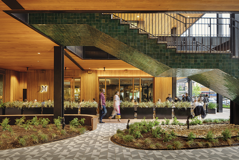
The spirited nature that the building alludes to along its public faces becomes more animated and vibrant at the core of the site. The warm wood cladding that was limited to the soffits along the perimeter becomes the dominant material, covering the walls and the ceiling of the covered deck. In addition to the wood, a collage of rounded masonry shingles, splashes of color, and white brick laid in a variety of patterns clad the walls of the core, providing identity to the tenants that line the covered walkways.
From this core, a series of staircases wrapped in glossy green tile rise to connect the ground plane to the various decks and terraces at the levels above. In describing the approach to these spaces, Hsu states: “We try to embrace vertical circulation and treat it as a ground plane experience. Instead of it being an expediency, it should be experiential.” The staircases connect a series of spatially diverse moments that unwind gradually. At each landing, new destinations present themselves. A few paths lead to apparent dead ends, but even those spaces feel as though they are only a cafe table away from being someone’s favorite space in which to quietly read a book.
Within these central spaces, the lighting and landscape play roles as important as the architecture. Artists were commissioned to design site-specific light features as well as the white graphic that floats along the ceiling and wraps up the east facade. At the ground level, the landscape designed by the Office of James Burnett contributes to the liveliness of the spaces: Elliptical beds of native plants break up the red brick and patterned tile of the walkways, while a series of cypress trees keep outdoor spaces comfortable during Houston’s summers. The green tile that clads the stairs feels like a placeholder for vines and hanging plants that will eventually take it over.
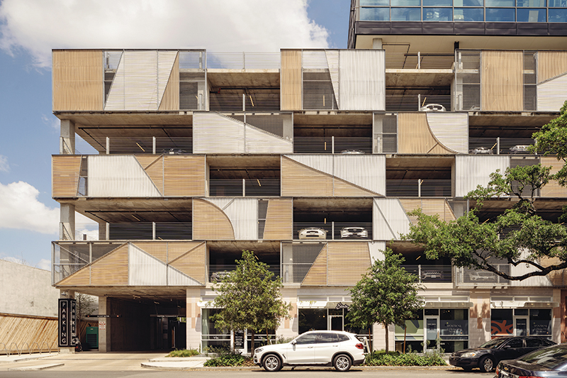
The north end of the site cleverly conceals the building’s parking garage, sandwiching it between the warehouse-like office spaces above and the boutique storefronts that line the sidewalks below. The multistory parking garage hides behind chain-link panels threaded with pink and white plastic strips. These panels stack like loose blocks with a pattern of fragmented curves and angles that serves to break up the scale of the parking structure. (It’s a bit unfortunate that this pattern doesn’t continue to the facade that faces the houses to the north.)
Parking in Houston isn’t going away, but the building demonstrates that it can be concentrated and consolidated. The garage signals that the city may not be over its addiction to cars, but at least it’s willing to seek help. The playful nature of the Montrose Collective suggests that this transition might even be fun, and this may be where its greatest contribution to the neighborhood lies. As cool as the building feels, perhaps its biggest impact isn’t about style but about the precedent it sets for the city’s future.
The entire block currently feels like a small oasis, but it also signal where the neighborhood is headed. Nearby residential towers and plans for a mixed-use development by another prominent designer a few blocks away suggest that the transition to a more walkable neighborhood is more than a trend. While future buildings along Westheimer may not be as materially stylish and future developers may not be as generous with their real estate, this design possesses the potential to be transformative at an urban scale. As Hsu modestly states, “It’s just one block, but I feel like little seeds like this are important.”
Ross Wienert teaches at the University of Houston College of Architecture and Design and practices at CONTENT Architecture in Houston.

Ross Wienert teaches at the University of Houston College of Architecture and Design and practices at CONTENT Architecture in Houston.