Austin Central Library: Architectural Crit
All Other Knowledge Rests
Project Austin Central Library
Client City of Austin
Architect Lake|Flato Shepley Bulfinch, a joint venture
Design Team Lake|Flato: David Lake, FAIA; Jonathan Smith, AIA; Steve Raike, AIA; Daniel Lazarine; John Taylor Schaffhauser; Margaret Sledge, AIA; Gus Starkey; Adrianna Swindle, AIA; Shepley Bulfinch: Sidney Bowen, AIA; Jim Chambers; Eric Haggstrom, AIA; Mark Finneral, AIA; Lynn Peterman, AIA
Photographer Nic Lehoux
After touring the newly completed Austin Central Library that his firm co-designed, Ted Flato, FAIA, turned to Jonathan Smith, AIA, who led the project for the office, and said, “It’s the largest lake house we’ve ever done.”
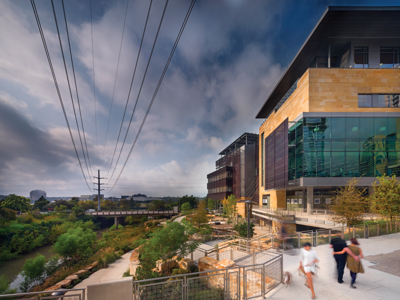
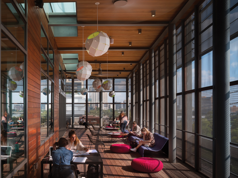
It’s easy to see what he meant. Looking at the building from its terraced landscaping along Shoal Creek, or poking above the trees from across Lady Bird Lake, the impression is very much that of one of Lake|Flato’s iconic Texas homes. The materials and design moves employed are in the same family, though rendered at a much larger scale. Lake|Flato has excelled at making buildings that seem to be in dialogue with the landscape and the sun, and they used the same rationales on this urban site. The cladding is a mix of roughback Lueders limestone, gray metal siding, glass, and perforated corrugated aluminum panels that have been anodized with a coppery finish, in reference to nearby City Hall. The perforations are modulated to best mitigate solar gain. Generous roof overhangs provide additional shading, and screened porches that overlook the creek and the lake are strategically located for views and to catch the prevailing breeze.
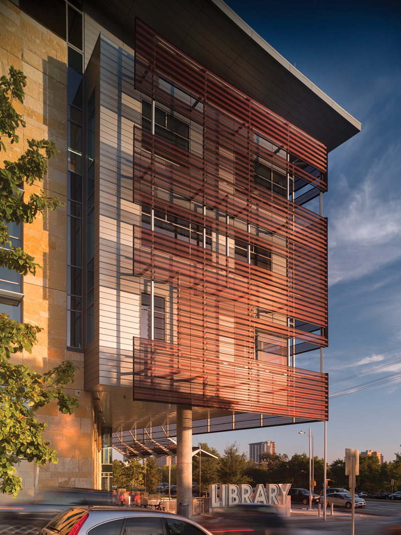
At the southwest corner is a sign that indicates the building’s function. Photo by Nic Lehoux.
Whether or not this well-exercised residential vernacular survives the increase in scale to a major civic project like a burgeoning city’s central library is very much a matter of opinion. The public hasn’t found it to be an issue (see Sarah Gamble’s article). Furthermore, the use of monolithically scaled roughback Lueders limestone on large urban projects has been an Austin tradition at least since Larry Speck’s Computer Sciences Corporation buildings (2002) and Austin City Lofts (2004), not to mention Antoine Predock’s City Hall (2004). The roof overhangs can be found on large academic buildings throughout the University of Texas campus, including the AT&T Executive Education Center (2008), which was designed by Lake|Flato in collaboration with HKS. “It’s very Austin,” Smith says. And he’s right.
Indeed, this was the mindset of city council. In 2008, it selected the duo of Lake|Flato and Shepley Bulfinch from a shortlist that also included the teams Barnes Gromatzky Kosarek Architects and Taniguchi with Holzman Moss, as well as Page and Patkau Architects. (The shortlist was refined from roughly 80 respondents to a city RFQ.) John Gillum, facilities process manager for the Austin Public Library, explains city council’s decision: “They told me why they picked them. They said, ‘Lake|Flato won every architectural award we can think of, and they tend to design buildings that look like they sprung out of the ground in Central Texas.’” Shepley Bulfinch had its own appealing credential: The Boston-based practice, legacy firm of Henry Hobson Richardson, has designed more than 200 libraries in its nearly 150-year history.
While it would be impossible to find a more decorated firm that works in the local idiom, what city council didn’t seem to consider at the time (or did it?) is what Austin was becoming. No longer a sleepy state capital and college town, by 2008, the population of the city was 767,201. It was fast growing into a major metropolitan center, rival in population and economic power to Texas’ great metropolises, with an international reputation for progressive attitudes and policies. That isn’t to say the appearance of the new library doesn’t represent those values. But, while city council was ordering up a modern-but-rootsy invocation of Texas building culture (the dogtrot came up in one early design conversation), Austin itself was plowing ahead with its late-capitalist present.
In 2008, the library site — which is bounded by Shoal Creek, Cesar Chavez, West Street, and 2nd Street — was occupied by a transformer for the neighboring Seaholm Power Plant. There wasn’t much between it and City Hall except for one of the Computer Sciences Corporation buildings. (Actually, one site considered for the project early in the process is now home to the W Hotel, right across the street from Predock’s building, where the material references would have been much more apparent.) Today, the library site is hemmed in by a forest of new mixed-use towers, none of which attempts to embody the regional architectural heritage. Beside these sentinels of internationalism, the library is a curious object, indeed. It also feels a bit short.
This is where city council’s choice of architects dovetails interestingly with city voters’ tendency to think small, in urban terms. For a city of its population — 947,890 in 2016 — Austin’s new Central Library is, well, small — roughly 198,600 usable sf on six floors and a 200-car garage below grade. By comparison, Seattle’s 2004 OMA-designed library is 362,744 usable sf on 11 floors, and Seattle is smaller, at 704,352 residents. Minneapolis, with less than half a million people, completed a 242,235-sf library in 2006, designed by Pelli Clarke Pelli. Even Jacksonville, Florida, with 821,784 people, built a bigger library. Designed by Robert A.M. Stern Architects and completed in 2005, it is 297,000 gross sf. Salt Lake City’s 2003 Moshe Safdie-designed library is closer in area, at 240,000 sf, but its population is only 186,440.
While the facilities planning team’s research led it to conclude that the library should incorporate more space — 400,000 sf was its first target — then-library director Brenda Branch didn’t believe voters would fund such an ambitious project. “We thought that would be a little rich for the citizens’ blood,” Gillum says. Back at the drawing board, the team cut the scope of the project roughly in half and came up with an estimated budget of $125 million. For safety, it was put on the city’s 2006 bond election at 250,000 sf and $90 million. The voters approved it by 60 percent.
Library boosters at the time greeted the vote as a wild success, while also acknowledging that the funds approved were not enough to realize their ambitions. “We went to work on the design and tried to force the project in under that $90 million ceiling that the bond election had put on us,” Gillum says. “But we finally threw up our hands and went back to city council and said, ‘I don’t think we can do it; we can’t build much more than what we already have in the Faulk Library, for that amount.’” To make up the shortfall between the bond funds and the original $125 million estimate (which is roughly what the library wound up costing) the city got creative. It allocated $10 million from the sale of the W Hotel site to the project and covered the rest with certificates of obligation — a mechanism by which local governments can lend themselves money without having to put it up for a vote, usually reserved for emergencies, such as disaster recovery. In this case, the “disaster” was Austin voters’ aversion to higher taxes and civic infrastructure.
(“If I could do it over, I’d go back to 400,000 sf,” Gillum says. “The demand is there. The city realizes that, too. If we built it twice as big, we’d be able to handle the crowds.” And there you have it. The new Austin Central Library is big for a lake house, but small for a major city’s central library.)
To make matters more challenging, city council also demanded a “Library of the Future.” “I hope I’m never given so hard an assignment again in my life,” Gillum says. Sympathies for this daunting task may be redoubled, considering the design team was starting out with half the budget and space it wished for in order to meet current — not to mention future — demand. Fortunately, they had a lot of help. No fewer than 30 consultants contributed to the design, including now-retired library futurist Joan Frye Williams.
The consensus around the proverbial drafting table was that no one could predict the future. To allay this basic human limitation, the team decided to make the building as flexible as possible so it could adapt to emerging needs. As a result, the reinforced concrete structure’s floor plates are extremely robust, capable of holding book stacks at any point, which allows the space to be easily reconfigured. The floors are also raised for easy access to wiring, meaning that outlets can be added, subtracted, or moved without much fuss.
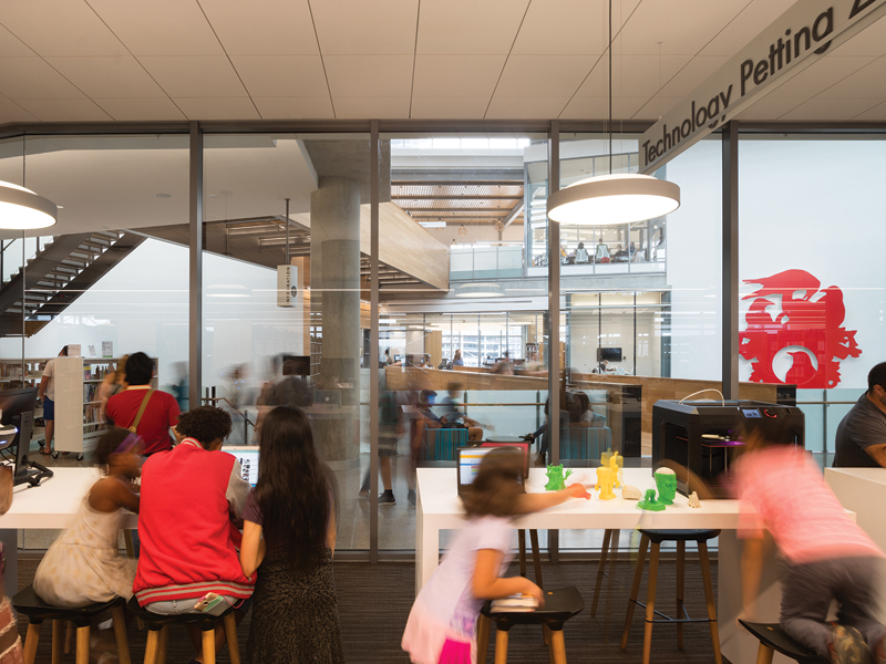
These future contingency measures in place, the team got on to the business of designing the best Library of the Present they could come up with. Faulk Library user comments, complaints, and requests were weighed and measured. Design charrettes were conducted to further gauge the public’s wants. Other cutting-edge libraries were visited for inspiration (notably two Dutch projects: the Openbare Bibliotheek Amsterdam by Jo Coenen Architect and the Mediatheek Delft by Dok Architecten). From these investigations, a program was drafted that included flexible event space, co-working suites, dedicated areas for children and teens, lots of technology, a homeless services center, a cafe, books, and parking (because this is Texas). As with the square footage of the building, there is too little parking, just 200 spaces. The garage seems to be perpetually full on weekends, sending many drivers to the nearby Seaholm development’s garage and causing traffic snarls — yet another reminder that density and automobiles don’t go together well. The library project did, however, include the construction of a new bridge that connects 2nd Street across Shoal Creek, improving accessibility by foot and bicycle.
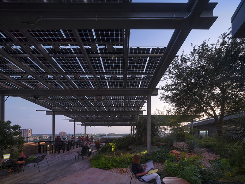
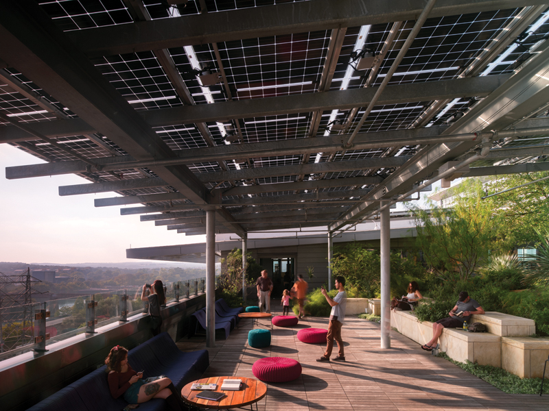
The team also decided to pursue a LEED Platinum rating. The library includes such green features as a 180kW photovoltaic array on the roof. Austin Energy donated $60,000 in order to tie the system into the downtown grid. In addition, a rainwater catchment system feeds into a 373,000-gallon cistern housed in an old Seaholm concrete vault. This water is used for irrigating the landscaping and flushing the toilets.
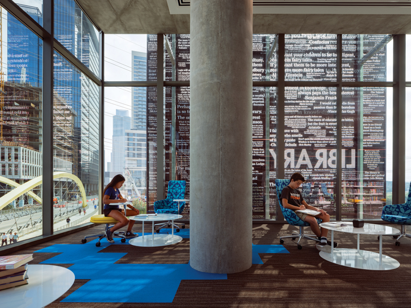
From an architectural standpoint, the prime motivator was creating the best daylit library in the U.S.A. Considering the floor area requirements, site constraints, and the additional goal of making an open, inviting environment for all, the architects wrapped the program around a sky-lit atrium. Working with Seattle-based daylighting consultant Integrated Design Lab, the team used a 1/4-scale physical model to tune the building’s apertures for optimal, glare-free natural light conditions. The solution included shading and light shelves along perimeter windows, and a specially calibrated skylight and baffled clerestory windows that accept north and south daylight and bounce it off a W-shaped acoustic plaster ceiling. They went so far in the daylighting scheme as to combat perceived dark spots — areas that would come out just fine on a light meter, but that in the human eye would appear to be darker. A glass bridge, one of several spanning the atrium (the others are wood and steel), was added for this reason.
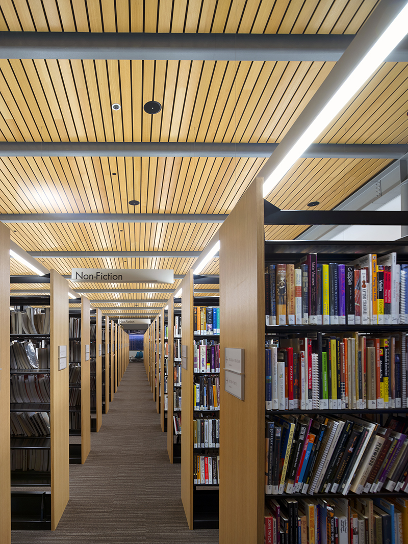
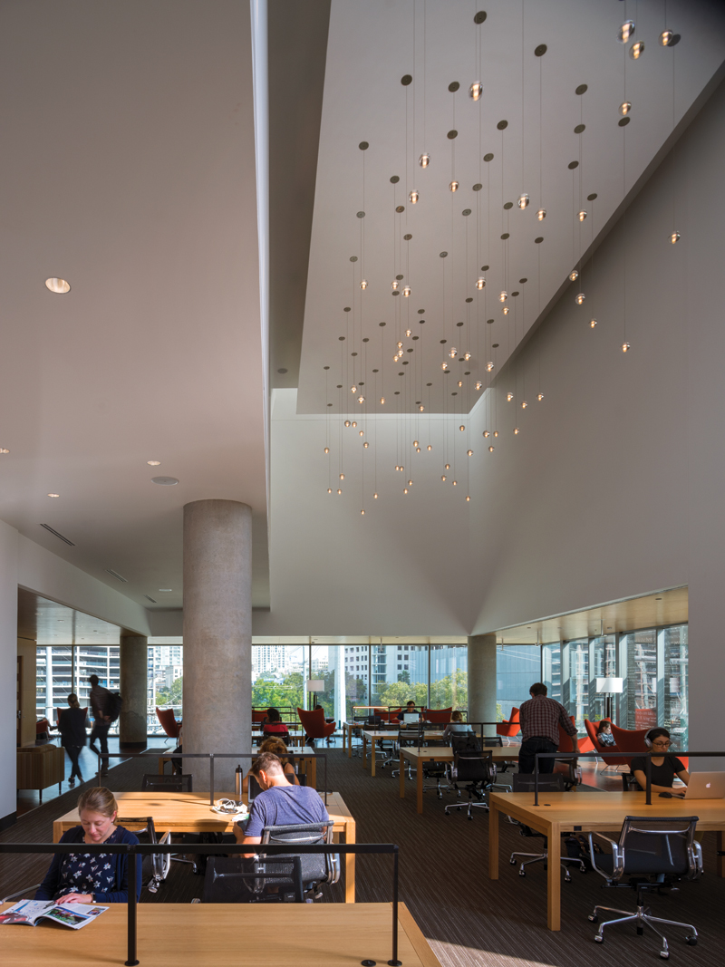
The new Central Library has twice as much room for books as the facility it replaces. The stacks can be easily rearranged at any point on the heavily structured floors. Photo by Nic Lehoux.
The atrium did create its own challenges for the architects. To keep this monumental interior volume from becoming dead space — what Smith calls “mall effect” — the team programmed the edges of the floors, ensuring an amount of lively activity at all times. To keep the space from causing vertigo, each higher floor steps back from the one below, so that there are few spots where visitors look down more than one level. This arrangement also produces an interesting effect in which the staircases link each floor at different locations. They curl around and climb through the cavernous interior, linking up in some places with the bridges that span the void; at others, with the edges of the exposed, geologically thick concrete slabs. This Piranesi-like construction could seem random, dizzying, if each move wasn’t so well choreographed, with new vistas of the space and through to the outside opening up at each landing.
The atrium, the whole building in fact, has a dreamlike quality. The silvery sparkle and dynamic fluctuation of the well-diffused daylight has an almost material presence, as though it were calibrated by James Turrell. The white oak treads of the stairs creak slightly as visitors traverse them, filling the space with a ghostly but strangely lulling ambient soundscape (the acoustics were tuned just right to appropriately dampen noises). The swinging pendulum of the 37-ft-tall, bright red, Grackle cuckoo clock that occupies the atrium’s one expansive white wall — “CAW” by artist Christian Moeller — lends the space an extra element of (architects look away) fantasy. When I first visited on the opening weekend, curious Austinites were streaming through the library, gawking at the building and touching everything they could. I felt as though I had entered the set of a Terry Gilliam film. I fully expected a band of time-traveling dwarfs to burst through a rift in the wall pursued by a very agitated Minotaur.
Smith, an Austin native, has been concerned and a bit dismayed about the changes his hometown has undergone of late. The coming of the tech industry, which has elevated the city to a level of national economic significance, has also eroded much of what made the town special, rendering it unaffordable for many of the weirdos who forged its post-1960s reputation as a countercultural hippie haven. The placeless, mixed-use towers that loom above the central library, with their Class-A office space and luxury condominium units, pricey boutiques and healthy eating establishments, are the constructed face of this change. Smith wanted the library to counteract those forces, to represent the Austin he remembers and to germinate its spirit in those who use the building. To this end, the interior is inlayed with regional craftsmanship: oak millwork and mesquite tile floors. The furniture (much of it made locally) and light fixtures have an eclectic, residential character reminiscent of a funky Austin coffee shop — there are even area rugs. On the top level is a shaded roof deck with a variety of seating options and a garden. The native vegetation planted there, which includes a lacey oak, was specifically selected to attract butterflies. And it works. Butterflies do hang out there.
This blending of institutional and residential, public and private, natural and man-made is intentionally counterintuitive, aggressively weird, just as parts of Austin were once weird. The building screams, “Keep Austin Weird!” It’s the flipside of a building like the AT&T Executive Education Center, with its gauche Texas patriotic finishes — all leather, lone stars, and longhorns — but it operates in the same way: as a reification of a state of mind. It’s a bit exhausting. After long exposure, it’s kind of nice to step outside and look at those placeless towers, minimally detailed boxes, where you could be anybody, anywhere, doing anything.
Aaron Seward is editor of Texas Architect.

Aaron Seward is managing editor at Perkins&Will and a former editor of this magazine. He lives in Austin.
Also from this issue
