Nov 04, 2020
It is, by design, dark, obscure. Some people, upon entering, feel uneasy, claustrophobic, creeped out. Others walk in, look around,…


A valid order accommodates the circumstantial contradictions of a complex reality. It accommodates as well as imposes. It thereby admits “control and spontaneity,” “correctness and ease” — improvisation within the whole.
— Robert Venturi, “Complexity and Contradiction in Architecture,” 1966
Complexity and contradiction are in the title of the manifesto, but that doesn’t make the category of postmodern architecture any less confusing. In Austin alone, postmodern design swings from the faux-marble laminate on the cabinets at the Charles Moore house to the very real, pink granite walls of office towers on Congress Avenue, to the kinda-art-deco Frost Bank Tower. Postmodern buildings are often derided as cartoonish and schlockily constructed, like stage sets for a goofball opera, but they also include some extremely permanent structures, like those 1980s office towers that are now being redeveloped en masse to appeal to a new generation of tenants.
Three firms — RIOS, Michael Hsu Office of Architecture, and HOK — have recently reimagined the public spaces of postmodern office towers in Texas. It seems fitting that the resulting projects propose different, even conflicting, visions of those spaces.
Of all the contradictory elements of pomo, among the most confusing is the tension between the humanism of the ideas laid out by Robert Venturi and Denise Scott Brown and the aggressiveness of the corporate architecture that evolved out of those ideas. Among other things, Venturi and Scott Brown were responding to the puritanical rigor of modernism by challenging architects to observe and respond to real, complex conditions rather than dealing with a “highly selective” set of problems. But by the 1980s, postmodernism had become the language of corporate America, its references less tongue-in-cheek than stone-faced. In scale and finish, lobbies were designed to intimidate, not accommodate. Surfaces were opulent, shiny, and hard — the better to echo back the sound of leather-clad footsteps — and “tenant amenities” meant a couple of Barcelona chairs in a chilly atrium.
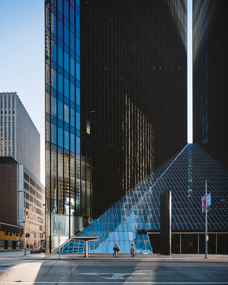
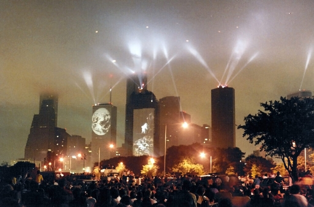
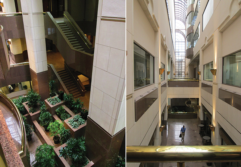
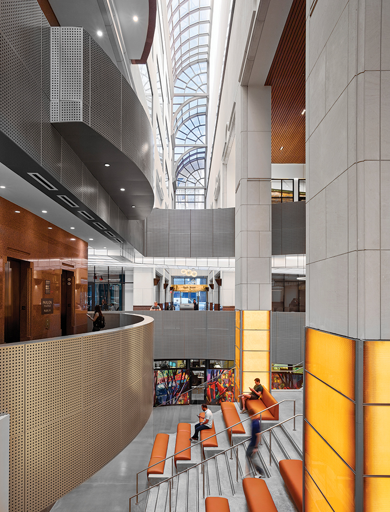
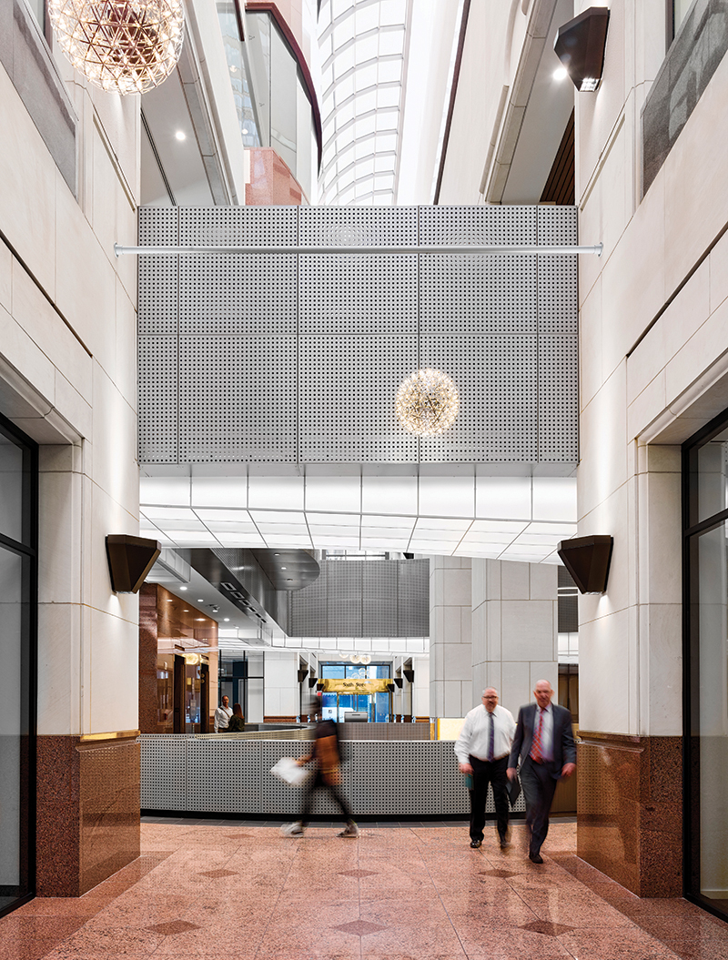
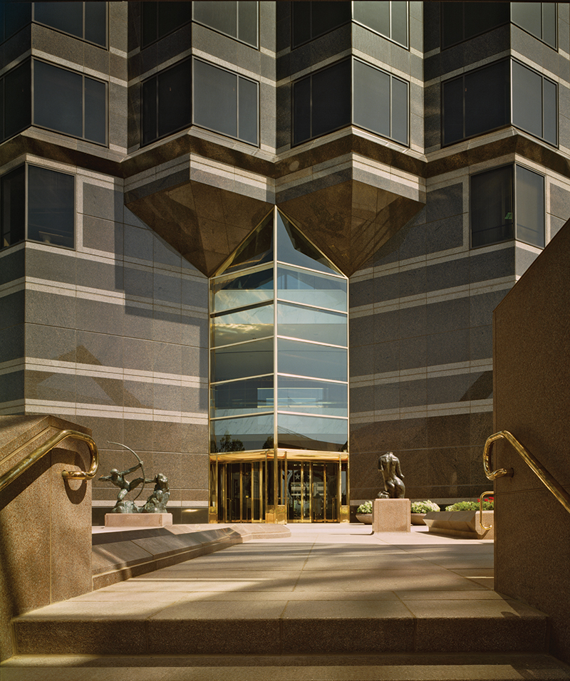
When 600 Congress opened in 1984 on the prominent corner of 6th and Congress in downtown Austin, it was, according to the Statesman’s Kim Tyson, “designed to dazzle.” Tyson reported that the opening would “unveil — to the strains of the Austin Symphony — … the most luxurious materials, the most highfalutin security and communications system, and a swanky new executives’ hangout.” Designed by Houston-based Morris-Aubry Architects, the tower seems to have been contentious from the get-go. It replaced a beloved art deco-era Woolworths, already an economic anomaly on Congress, described by the Statesman’s Michael McCullar as “a kind of retail carnival for office workers and bus riders.” To discourage people from sitting on the building’s generous windowsills, management installed cast-iron knobs. The rest of the building was equally unwelcoming. Entries were — and remain — monumentally framed but small. The soaring atrium was occupied by a fortress-like stair. Daylight coming through the curved skylights collided with the granite of the interior and bounced back dim and purple.
Andy Lantz, Assoc. AIA, who led the renovation for RIOS, described the challenge as exciting. “600 is really special to us because it was the first version of us getting into adaptive reuse for what I call historic structures. Some people don’t consider postmodernism historic, but coming from my generation of school, it was kind of the equivalent of going to Rome. … The postmodern American style captured so much of what commercial working was, good and bad: It is unabashedly masculine; it is tall and marvelous in its finishes; it is vacuous and without a connection to its adjacent culture and places. It is all these things. And we were trying to reimagine the legacy of that in the good and bad, and reinvent it for new uses.”
Part of the challenge was to attract new tenants without alienating the existing tenants, some of whom have been in the building since its dazzle days. Now, the kind of attorney practices that made headlines in the ’80s for installing leather floors in their executive offices must coexist with WeWork, which advertises “interior design inspired by Wes Anderson films” and “hip-hop lyrics on the walls to motivate the hustle.” For Lantz, the reimagining of the public spaces also promotes a reimagining of work: “A lot of our workspace clients love these projects because they can imagine beyond their boundaries. So if they have goals and aspirations to be more public-facing, or more community-focused, these new developments have those components.”
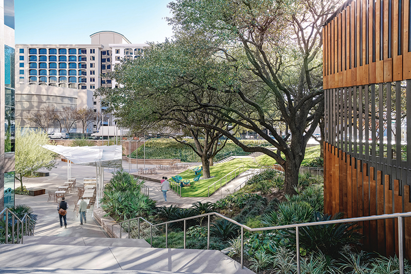
RIOS’ first move was to open up the atrium, removing the giant stair (the elevator core at the back of the building remains) and replacing that space with an appropriately cartoonish giant sofa: a large stair upholstered in leather that provides a space for informal meetings or a break from the office or the heat of Congress Avenue. The second was to address the finishes, lightening the interior through the use of perforated metal cladding “with a little bit of shimmer,” orange-toned acrylic panels to provide warm light, and sculptural lighting to emphasize the giant stair. A third move, still under consideration (and a compelling idea), would be to activate the “Chrysler Building-like” upper floors with outdoor decks and balconies as public space.
Another part of the challenge was to connect the lobby to its urban context. Custom wallpaper on the lower level by Austin artist Sari Shryack presents a colorful cartoon version of Austin, and Lantz points to SXSW and Austin Design Week events that used the giant stair as a kind of amphitheater. Currently, the building is largely unoccupied, except by two security guards (was their mall-cop surliness a cheeky reference to ’80s movies? How about the Kenny Loggins soundtrack? No, says Lantz). Lantz and RIOS also consulted on the newly built 901 E. 6th Street (Thoughtbarn/Delineate Studios), a project in which ideas of urban connectivity and broad appeal are gracefully addressed throughout the entry area. At 600 Congress, the theatricality is evident, but without people, it’s not entirely clear what kind of drama the setting will encourage.
By 1987, when 111 Congress opened, developers were “not in a partying mood” (as Michael McClure wrote in the Statesman next to a headline reading “Dow Ends Week With a Big Loss”). Still, the building got a lot of attention and drew comparisons to 600 Congress for its imposing presence in the emerging Austin skyline, its use of pink granite, and its stepped silhouette (driven by setback requirements then in place). Designed by architect Victor Lundy, FAIA, who designed such modern buildings as the United States Tax Court Building, 111 Congress was better received than 600. A large part of its appeal was in its siting: Lundy situated the building diagonally at the northeast corner of the site, leaving a generous plaza on the southwest corner of Congress and Cesar Chavez. Inside, the granite of the upper lobby walls was softened by a wood-panelled ceiling. But by the 2010s, the building owners were also looking for ways to improve the building to attract new tenants. Maija Kreishman, AIA, managing partner at Michael Hsu Office of Architecture, sums up the challenge: “The owners knew that if they could provide an asset internal to the building, that would be their leverage to reinvigorate a tower that had had 30+ years of use. And we knew we had this amazing urban park, so the conversation was, how can we not only revamp this building but also reactivate that?”
The economic crisis of the ’80s was arguably fortunate for what is now known as One Eleven: A sister building planned for the northwest corner of the site never got built. Instead, the owner planted trees. No part of the building touches Congress. The challenges for MHOA, then, were manifold: how to activate both building and plaza while retaining the distinction between public and private, and how to mediate between the scale of the 30-floor tower and the sidewalk.
With the exception of furnishings, the upper lobby remains unchanged. The architects chose to focus their efforts on the lower level, which has become (at least until recent times) one of the liveliest areas of downtown. Cousins Properties had considered turning the lower level — essentially a basement, despite its adjacency to the plaza — into formal restaurants. Instead, MHOA proposed what is now Fareground, a food court featuring local restaurateurs. Now, the space once occupied by escalators is an atrium connected to the upper lobby by a steel stair fabricated by Sarabi Studio and Patriot Steel Erectors. MHOA tapped Warbach Lighting, another longtime collaborator, to fabricate a sculptural light fixture, which, along with a floating, swooping wood-slatted box, serves both to create Instagrammable moments and to create a more residential scale for the space below.
Michael Hsu, AIA, like Venturi, embraces complexity: “We talk a lot about both/and in our office, as opposed to either/or. This is a both/and project: both grand and small-scale, urban and residential.” He notes that the post-structuralist thought that gave rise to postmodernism is still very much in play: “Maybe the look of postmodernism isn’t as we remember it from the ’80s. But postmodernism as a philosophical design process is very much alive. That means we’re borrowing more from everything; there isn’t a stable aesthetic; design and social structures are dynamic. We’re seeing that politically, and we’re seeing that aesthetically. We talk about architecture now in terms of experience, not as objects.”
Physically, that complexity is reflected in materials, texture, and patterns by turns urban and residential: custom concrete tile that plays off the granite (Notes Kreishman: “Texas Red granite does not play well with everything”); walnut floors; butcher block. It’s also reflected in a gradient of energy and activity that moves from the underground tunnel to the parking garage, into an intimate seating area tucked under a stair (this can also open up to connect to a meeting room or event space), and past the stairs into a transitional area, anchored by food vendors, that opens to the activity on the plaza. Each chef was responsible for the design of their space, their wares and spices and rotisserie chickens lending more liveliness to the mix.
From an aerial perspective, the new plaza reads as an inhabitable sculpture. Ramps and stairs lead pedestrians down from the sidewalk; a gentle slope provides ample opportunities for informal lounging; and a folded steel trellis casts geometric shadows onto the courtyard. To anchor the northwest corner, MHOA proposed a small wood-and-glass structure, somewhere between building and landscape. The architects had to request a variance to build something so small, but as Hsu notes, “fortunately the board agreed that the scale was appropriate.” Now known as Ellis for the restaurant it houses, the structure was awarded an AIA Austin Design Excellence Award in 2020.
Hsu describes Ellis as “an important tuck point within the urban experience.” The same could be said of the plaza as a whole. Part of what’s so appealing about One Eleven is the variety of experiences it accommodates — including those nonremunerative activities like “solitude, observation, and simple conviviality” that artist Jenny Odell describes as having no place (often literally) in a capitalist society. Recently, and perhaps again in a not-too-distant future, you could go to One Eleven to make serious money; you could go and drop $10 on a bowl of ramen at Ni-Kome (wistful note: worth it); you could also sit on the grass and daydream for free.
In 1986, in an article criticizing 600 Congress for those anti-sit knobs, Michael McCullar brought up the idea of corporate responsibility in design. “[T]here is a kind of architectural noblesse oblige that a building of that size, and in that location, should gracefully bear. Although not a public building in the strictest sense of the term, [the building] has a public responsibility — to be open and courtly to those who pass by, not closed and threatening.” Milton Friedman took a hatchet to the idea of noblesse oblige when he convinced business leaders that a firm’s main responsibility was to its shareholders. But, increasingly, building owners are seeing the value of making places that appeal to a broader audience. Says Hsu: “Now we know that activation equals success, when you’re talking not only about downtown and placemaking but about real estate and the sort of financial equations that these owners are trying to figure out.”
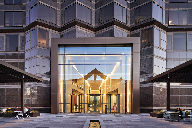
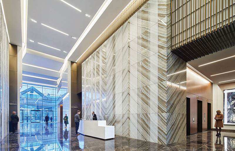
In program and in design, 111 Congress is heavily driven by hospitality. HOK’s renovation of the Trammell Crow Center in the Dallas Arts District takes a different approach. Senior Principal Ben Crawford, AIA, who led the redesign along with Jim Halloran, director of design for interiors, describes their intent to create a more permanent experience: “a ceremonial, cathedral-like experience” for work.
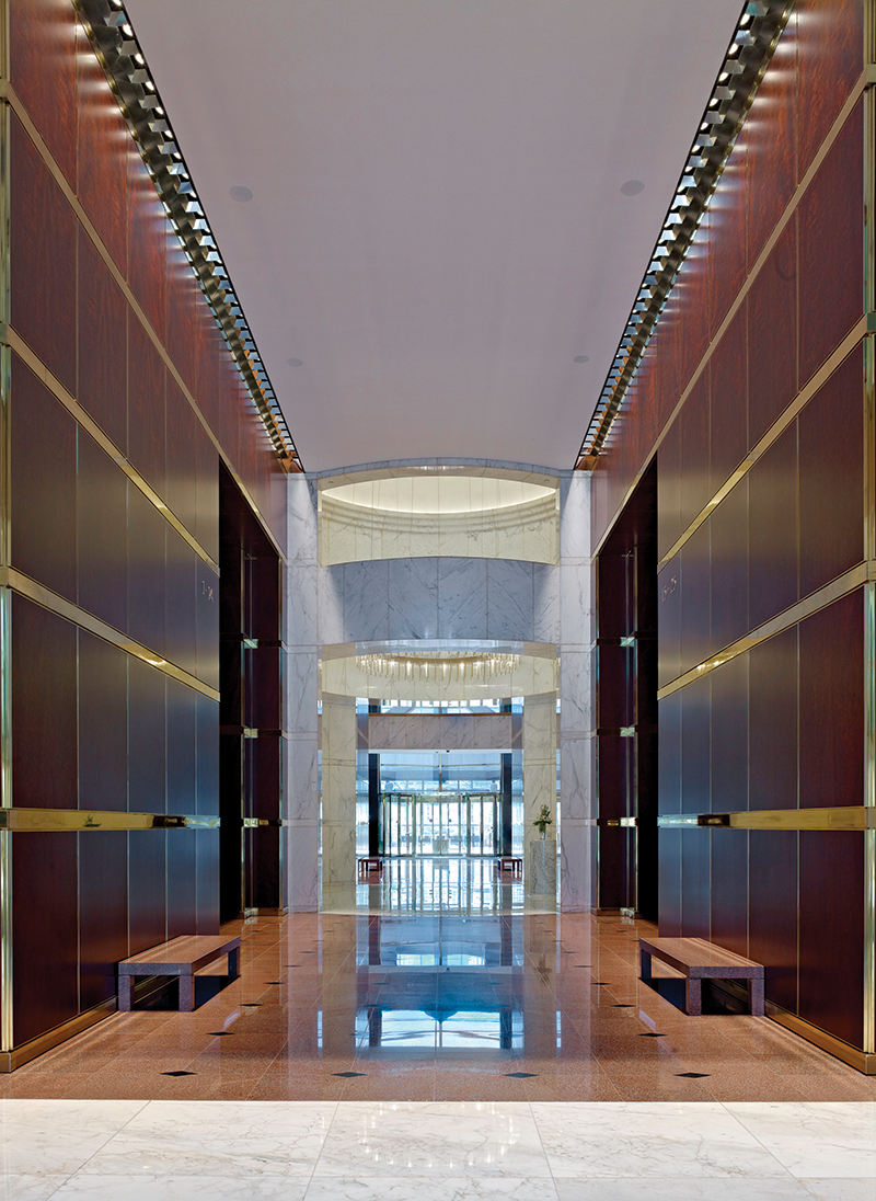
The Trammel Crow Center, which opened in 1985 as the LTV Center, was, in Crawford’s words, “very much not downscale” — not just Class A office space, but Class AA. In keeping with its location, nestled between the Dallas Museum of Art and the Nasher Sculpture Center, its lobby housed first a collection of Renaissance art, then the Crow Collection of Asian Art. It was also very much not welcoming: Crawford describes “literal ramparts around the building.” The large interior space was accessible only through “incredibly small entries for a building of this scale,” which were also mirrored; as a result, pedestrians walking between the museums generally chose to walk around, not through, the building. The original interiors by Keating could be described as corridors of power: opulent materials lining narrow passageways. Says Halloran: “It was very dark, very moody — that was the beauty of the original design. But it wasn’t [a space] that people felt pulled to use.”
Crawford describes their approach as respectful to the original design, but with a view toward the next 30 years: “The wood was gorgeous; the brass was always polished, so creating something that felt qualitatively similar was important. And what we did was to simply carve out what we needed to allow that volume to read through, and then to buffer it with great program on either side.” The renovation opened up the lobby, literally and figuratively: Small, mirrored entries were replaced by a giant glass-fronted box, and it is now possible to see all the way through the building. The architects also inverted the flow: Instead of narrow spaces circulating around an elevator core, there is now a series of interconnected spaces around a central hall. The finishes are lighter — Carrara marble instead of wood panels — but it is still a very formal, beautiful space. The art was designed for the building, and Halloran’s team designed for the art: A sculpture by Jeremy Thomas is a visual counterbalance to the floating marble stair. The architects also created a more permeable exterior, bringing light in and allowing activity to spill out of the building into the gardens.
There have been ripple effects for the entire neighborhood, says Halloran: “It’s also made some people who thought they would never go to the Central Business District realize how approachable the CBD is. It’s spurred other development around the neighborhood that nobody thought would happen.” Crawford says, “It’s formal in scale and material quality, but informal in that it’s very loose in terms of how people can circulate around and through.” In short, it’s another both/and building: both formal and welcoming, both private and open, both noblesse and neighbor.
Over at The University of Texas at Austin School of Architecture this past spring, students were exploring postmodern ideas with pom-poms and an alarm clock. For instructor Adam Miller, the 2019 Race and Gender in the Built Environment Fellow, the point was for students to look beyond the traditional binary of beautiful/ugly — with all the assumptions about gender, race, and class embedded therein — to a wider range of characteristics, for instance, pompous, cheeky, or cute. Says Miller: “Good taste tends to act as a gatekeeper, discounting both historical and vernacular architectures.” The real beauty in complex architecture is its ability to include complex voices, and as a result, to address complex problems. While there are some binaries we may be happy to see again — chief among them, work/home and home/school — complexity feels very much of the moment.
Jessie Temple is an architect and writer in Austin.