Jul 14, 2017
Project Cheatham Residence, Dallas Client Diane and Chuck Cheatham Architect Tod Williams Billie Tsien Architects | Partners Design Team Tod Williams, FAIA; Billie Tsien,…


When Bart Shaw, AIA, met young entrepreneurs Alari Paxson and Winston Parker Ley, they had a clear concept for their men’s and women’s wear store, Pax & Parker. The two business partners had secured a lease space in Fort Worth’s West End, begun curating their fashion collections in earnest, and had even commissioned a logo. Their vision for the architectural space was less defined. It was presented to Shaw as a collection of disparate inspiration images pinned to a Pinterest board. The architect would be charged with crafting the look and feel of the flagship location, helping solidify the retailer’s identity. Shaw decided to keep it simple. Using the square logo as inspiration, he built on both its geometry and its sharp lines.
The square motif occurs throughout the space, beginning with the entry. The storefront is rendered in stacked courses of square format masonry units. Punched openings adhere to the module, maintaining alignment with the coursing. Deep steel plates interrupt a large expanse of glass, creating a square frame around the display window and providing a platform for mannequins on the interior. Even the door pull conforms to the square geometry and — something only an architect would notice — matches the masonry dimensions precisely. Inside, a tailored composition of eight-in square plywood pieces in varying thicknesses forms textural wall panels. The display fixtures and cash wrap continue the theme, reflecting the clean lines and geometry of the logo.
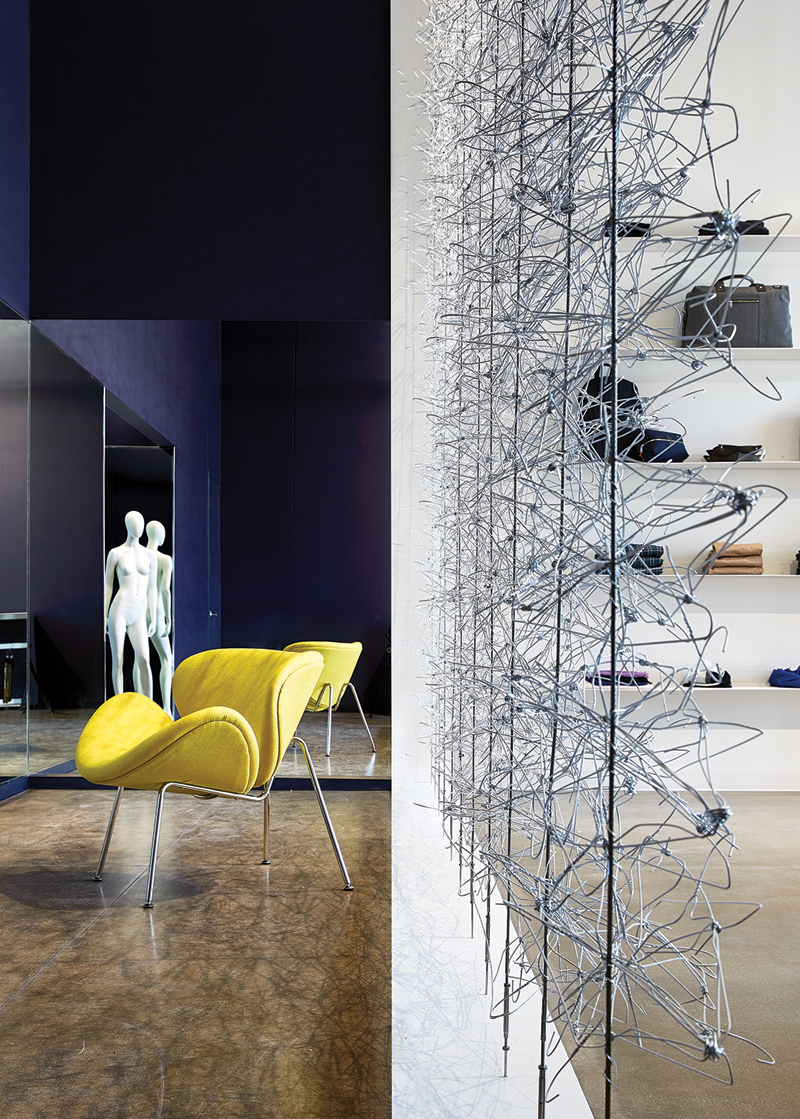
The start-up retailers had a tight budget for their first store, further challenging the architect’s task. Shaw responded with a series of clever design decisions that reduced expenses while maintaining quality. The masonry cladding was surplus from another job and purchased at a discount. Plywood was chosen in lieu of milled wood veneer panels. The custom store fixtures were conceived as minimal frames assembled from standard steel profiles, and the team enlisted a welding instructor from Tarrant County College to fabricate the components on-site. The most notable element is the screen between the sales floor and the fitting rooms. Here, Shaw concocted (and personally installed) a modular assemblage of mundane wire clothes hangers that are supported by vertical aircraft cables. The gauzy backdrop evokes a delicate spider web and counterbalances the crisp lines that dominate the space.
The store has become a crucial part of the retailer’s brand identity. Instagram photographs feature the season’s new arrivals hanging from the custom display fixtures or against the plywood-paneled wall. The wire hanger screen has become a recognizable feature, prompting the owners to integrate it into their branding materials. More importantly, Shaw has created a space that embodies the retailer’s values. Customers shop in an intimate, uncluttered, and light-filled environment. Minimalist fixtures and a restrained material palette play a supporting role to the merchandise, allowing the carefully curated apparel to shine. Sophisticated without the pretense, Pax & Parker is anything but square.
Audrey Maxwell, AIA, is a principal at Malone Maxwell Borson Architects in Dallas.

Audrey Maxwell, AIA, is a principal at Malone Maxwell Dennehy Architects in Dallas.